The Right Trigger Words
CNN.com’s designers have gone out of their way to make their work difficult. They could have built a very simple home page with just their logo and a handful of links:
- The Most Important Story
- The Second Most Important Story
- The Third Most Important Story
- An Unimportant, Yet Entertaining Story
- Yet Another Story about Michael Jackson
If this was CNN’s home page, the designers could go home and not have any work for weeks. After all, what is a news site’s home page but a list of links to the most important stories? (And the unexplainable insatiable curiosity about Michael Jackson’s latest antics.)
Yet, these links aren’t effective for users because they’re missing a key component: the Trigger Words. Trigger words are the words and phrases that trigger a user into clicking. They contain the essential elements to provide the motivation to continue with the site.
The Move-Forward-Until-Found Rule
When dealing with information, a web page can do only one of two things: either it contains the content the user wants or it contains the links to get them to the content they want. If a page doesn’t follow this rule, then the users stop clicking and they aren’t likely to find their target content.
CNN.com’s home page follows the Move-Forward-Until-Found rule: Almost one-third of the home page is content—the most important story of the moment. (Because it’s news, this content is updated every 15 minutes, giving the CNN developers plenty to do all day.)
The rest of the page contains dozens of links, in case the top story on the home page wasn’t everything the user wanted. These links only work when they contain the right trigger words. It’s CNN’s mastery of trigger words that make it so interesting.
Dissecting Detailed Descriptions
A few years ago, we studied a handful of users while they searched for specific items of interest on large web sites. These were items they were interested in and no two users searched for the same items in this study. Each item they searched for was on the sites we were studying.
Before every user started their search, we interviewed them extensively about what they hoped to find. We had them describe their targets in excruciating detail. We recorded every word they said. Then, we set them off on their hunt, recording every page they visited on the site.
After seeing which users succeeding at finding their target content and which didn’t, we analyzed each page they visited thoroughly, including the home page. Part of our analysis including studying the words they used to describe their targets.
It turned out that users were far more successful at finding their targets when the description words, which they told us before they saw the site, appeared on the home page. In the tasks where users successfully found their target content, the description words appeared on the home page 72% of the time. When users were unsuccessful, their words only appeared an average of 6% of the time on the home page.
Description words are a major type of trigger word. This study indicates that if those trigger words are found on the home page, users are far more likely to get what they are looking for.
Trigger Words as Search Keywords
Another interesting fact from that study: In those tasks where the users didn’t find their target, they were far more likely to use the site’s Search function than in those tasks where the description words appeared on the home page. When the words did appear, users usually clicked on the associated links instead of using Search.
In fact, when users did eventually go to Search, they almost always typed one or more of the description words as their search terms. It makes sense to us that users would use their description as their search term. This was when we realized the failed searches in a site’s search log are important clues to understanding the users’ trigger words.
Getting Scent from Flower Displays
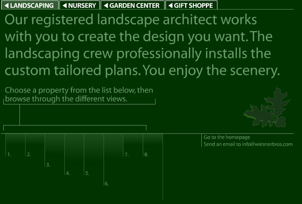
It would be silly for the CNN.com home page team to change to the generic links above. However, you’d be surprised how often it happens. One of the more outrageous examples is the site for the popular Staten Island landscaper, Wiesner Brothers. After clicking on the landscaping link at the top of the home page, the user is presented a page for which the only links are the numbers 1, 2, 3, 4, 5, 6, 7, and 8, representing different showcase projects from the landscaper.

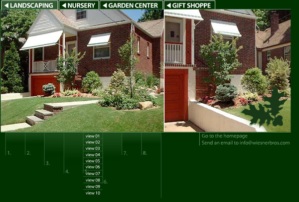
You’d be hard pressed to provide less trigger words than these designers have. When the user clicks on a number, say #5, they get a new set of links with a similar lack of trigger words. Here you get links that are labeled “View 01”, “View 02”, “View 03” and so forth.

It’s obvious that the designers intended the user would focus on the beautiful landscapes and just click through each picture serially. Maybe that’s the case, at which point this design may be optimal for that use. (We don’t know because we haven’t tested it.) However, is it possible some users are coming to the site with a specific project in mind? How would they jump to those showcases that are most similar to their project? Would they become frustrated having to look through unrelated projects?
An Analogue at Analog
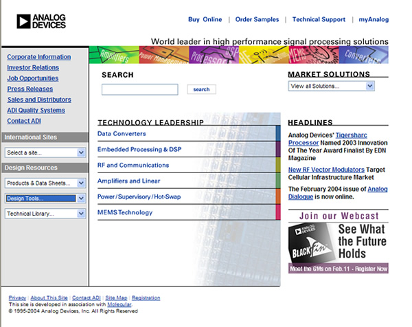
If you visited the web site for Analog Devices a few years ago, it looked like many other high tech product company’s sites: a single 800×600 design that had a few key category links like “Data Converters”, “Amplifiers and Linear”, and “Corporate Information”. Just what you’d expect for a leading electronics producer.

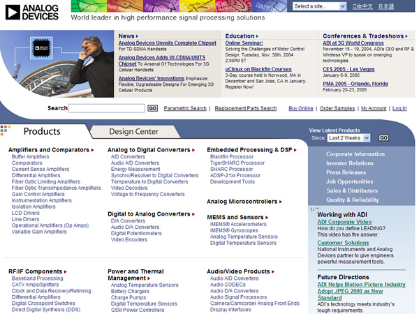
Recently, however, the site has completely redesigned. With the help of our friends at InContext Enterprises, Analog has major revamp of their home page. This new design tested very well with users and the company has already seen positive effects.

What’s the big difference between these two designs? Well, beyond the increased use of screen real estate, the major difference is the huge number of trigger words they’ve added to the home page. Since many of Analog Device’s customers are engineers looking for information about components to build into their products, the company has focused on making sure their trigger words appear on the home page. Instead of having to guess what major category a particular component falls under, the engineers now can quickly pick the closest component out of a list, going directly to the content they desire.
Identifying Users’ Trigger Words
How do you find out what your users’ trigger words are? Well, you start by asking them.
Visiting your users in their natural environments is a wonderful way to start. You can bet that Analog Devices didn’t make their changes without spending time watching engineers research and select components.
We’ve found that personas are a great way to communicate trigger words to everyone on the design team. A persona is a detailed description of a user the team wants to ensure is successful on the site. Listing, within the persona, the trigger words that person would use helps the designers understand how the users’ own language will impact the final design.
In addition, we’ve never conducted a usability test that didn’t yield tremendous insight into how users react to the links the team is using. It becomes obvious immediately when links are missing the clues the users need to go forward.
This powerful trio—field studies, personas, and usability testing—are a great way to start identifying the trigger words that work for your users.
Getting the Most Out of Every Link
The purpose of every link is to move users forward. Each link needs to give off enough “scent” to clue the user into the content to follow. That scent comes from the trigger words. When creating new content, the designers’ most important task is to ensure that the links to that content contains the right trigger words.
UX Leadership and Influence program
(Formerly called the How to Win Stakeholders & Influence Decisions program.)

Our 16-Week program guides you step-by-step in selling your toughest stakeholders on the value
of UX
research and design.
Win over the hardest of the hard-to-convince stakeholders in your organization. Get teams to
adopt a
user-centered approach. Gain traction by doing your best UX work.
Join us to influence meaningful improvements in your organization’s products and services.
Learn more about our UX Leadership and Influence program today!

