Testing the Three-Click Rule
In a recent client meeting, a high-ranking executive told us that every piece of content should take no more than three clicks to access. We knew exactly what he was talking about: we’ve heard the Three-Click Rule many times before. This unquestioned rule of web design has been around nearly as long as the web itself.
On the surface, the Three-Click Rule makes sense. If users can’t find what they’re looking for within three clicks, they’re likely to get frustrated and leave the site.
Many of us have the frustration of endless searching ourselves. We go to a site, click through various pages of content, and end up ready to quit. In one of our studies, a perplexed user threw up her arms and pronounced, “I should be able to find everything on a site in just three-clicks!” The Three-Click Rule directly addresses this frustration, acknowledging a user’s desire for fast gratification and the threat that a competitor’s content is only a click away.
Many have written about the Three-Click Rule. For instance, Jeffrey Zeldman, the influential web designer, wrote about the Three-Click Rule in his popular book, Taking Your Talent to the Web. He writes that the Three-Click Rule is “based on the way people use the Web” and “the rule can help you create sites with intuitive, logical hierarchical structures”.
In our own research, we’ve seen evidence that data about clicking helps us recognize problems on a site. For example, in one e-commerce study, we found that the more pages users visited (more clicks), the less they bought. (See the article, Strategies for Categorizing Categories). What we noticed in that study, however, was that users who were clicking the “Back” button multiple times were the ones who were failing. So we weren’t sure whether the number of clicks mattered, or if it was something else that caused them to fail.
Applying the Three-Click Rule leads to a number of design suggestions, such as putting global navigation on every page and making a navigation hierarchy shallow and wide. While these suggestions seem a natural extension of the Three-Click Rule, they assume the rule is worth following. After hearing about the rule for many years and having it as a requirement in some client projects, we decided to find out if the rule was true.
Do Users Really Leave After Three Clicks?
If the origins of the Three-Click Rule come from actual user behavior, then we should see a relationship between a user’s success at finding the content they’re seeking and the number of pages they visit.
To see if we could find this kind of relationship, we looked at data from a recent study of 44 users attempting 620 tasks. We counted the clicks of every task, whether the user succeeded or failed at finding their desired content. We analyzed more than 8,000 clicks!
In trying to complete the tasks, some users visited as many as 25 pages before they ended their task and others only visited two or three pages before stopping. If the Three-Click Rule came from data, we would certainly see it with this wide variation in the number of pages they visited.
As we study our data, the rule tells us we should see users dropping off after hitting the third page, leaving before they have a chance to succeed. Those tasks that took as many as 25 clicks would be unsuccessful, with the majority of successful tasks falling somewhere close to three clicks in length.
Users Kept Clicking
If there is a scientific basis to the Three-Click Rule, we couldn’t find it in our data. Our analysis left us without any correlation between the number of times users clicked and their success in finding the content they sought.
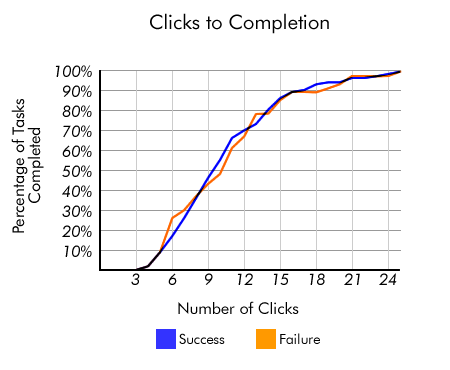
Our analysis showed that there wasn’t any more likelihood of a user quitting after three clicks than after 12 clicks. When we compared the successful tasks to the unsuccessful ones, we found no differences in the distributions of tasks lengths. Hardly anybody gave up after three clicks.

According to the Three-Click Rule, most people give up after three clicks. However, in our study, users often kept going, some as many as 25 clicks. According to our data, the Three-Clicks Rule is just a myth.
In this chart, we should’ve seen the majority of successful clickstreams ending around three clicks. However, for both successful and unsuccessful clickstreams, we see that it isn’t until 15 clicks that we see 80% of our tasks completed. Successful clickstreams have the same distribution as unsuccessful clickstreams—the number of clicks doesn’t predict task success or failure.
The failure to find task data to support the Three-Click Rule made us rethink the problem. Could task success and failure be the wrong way to look at it? Maybe everyone believes in the rule because it’s frustrating to keep clicking beyond the third page? We decided to look at the problem from a different angle.
What about Satisfied Users?
If we looked at the tasks that were dramatically longer than three clicks, do we see a drop in the satisfaction of the users? At the end of each of the 620 tasks, we had asked users to rate how satisfied they were with the site for that task. Again, there was a wide variety of answers—sometimes users were very satisfied, other times they were completely unsatisfied. Did these ratings correlate with the number of clicks?
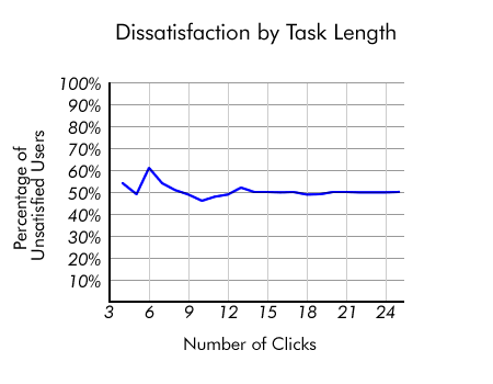
After analyzing the satisfaction data, we still found no evidence for the Three-Click Rule. When we looked at the percentage of users who were unsatisfied, our data showed there was little variation (between 46% and 61%) between different lengths of clickstreams. Fewer clicks do not make more satisfied users.

Users weren’t any more satisfied with shorter clickstreams than they were with longer clickstreams. The satisfaction of users doesn’t depend on the number of clicks.
Implications of User Frustration
In our studies, users complain about how long it takes to find things all the time. This is one way that users vocalize their frustration. They tell us that if they could only reduce the number of frustrating clicks the site would be better.
However, these complaints aren’t actually about the clicks. They are really complaints about failing to find something. When users find what they want they don’t complain about number of clicks.
We see this phenomenon quite often: users complain about a symptom and not the real problem that caused it. They want to explain why they are failing, and in this particular case, one of their initial thoughts is that they are clicking too much.
A Misdirected but Well-Intentioned Rule
The Three-Click Rule isn’t completely bad. People talk about it with users in mind, even executives who have never designed a web site. The rule may help designers focus on the information that users need and may help them create better web sites. These are admirable qualities.
We can’t be overly critical of a rule that has the effect of helping designers keep their focus on users and their needs. However, the Three-Click Rule does not focus on the real problem. The number of clicks isn’t what is important to users, but whether or not they’re successful at finding what they’re seeking.
UX Leadership and Influence program
(Formerly called the How to Win Stakeholders & Influence Decisions program.)

Our 16-Week program guides you step-by-step in selling your toughest stakeholders on the value
of UX
research and design.
Win over the hardest of the hard-to-convince stakeholders in your organization. Get teams to
adopt a
user-centered approach. Gain traction by doing your best UX work.
Join us to influence meaningful improvements in your organization’s products and services.
Learn more about our UX Leadership and Influence program today!

