
The Diagram that Shows the Value of Great UX

One of the questions I get an awful lot these days is, “How do we show that a great experience produces immense value for the organization?”
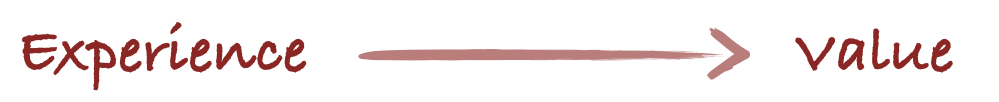
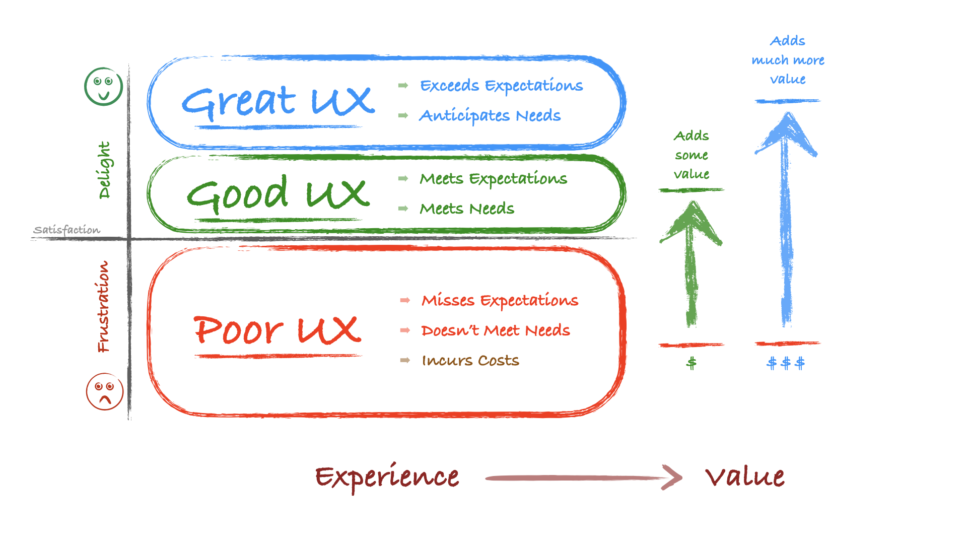
We can think of experience as a spectrum from extreme frustration to delight. Our work is to transform our users’ experiences from being frustrated to being delighted.
We can draw the spectrum to look like this:
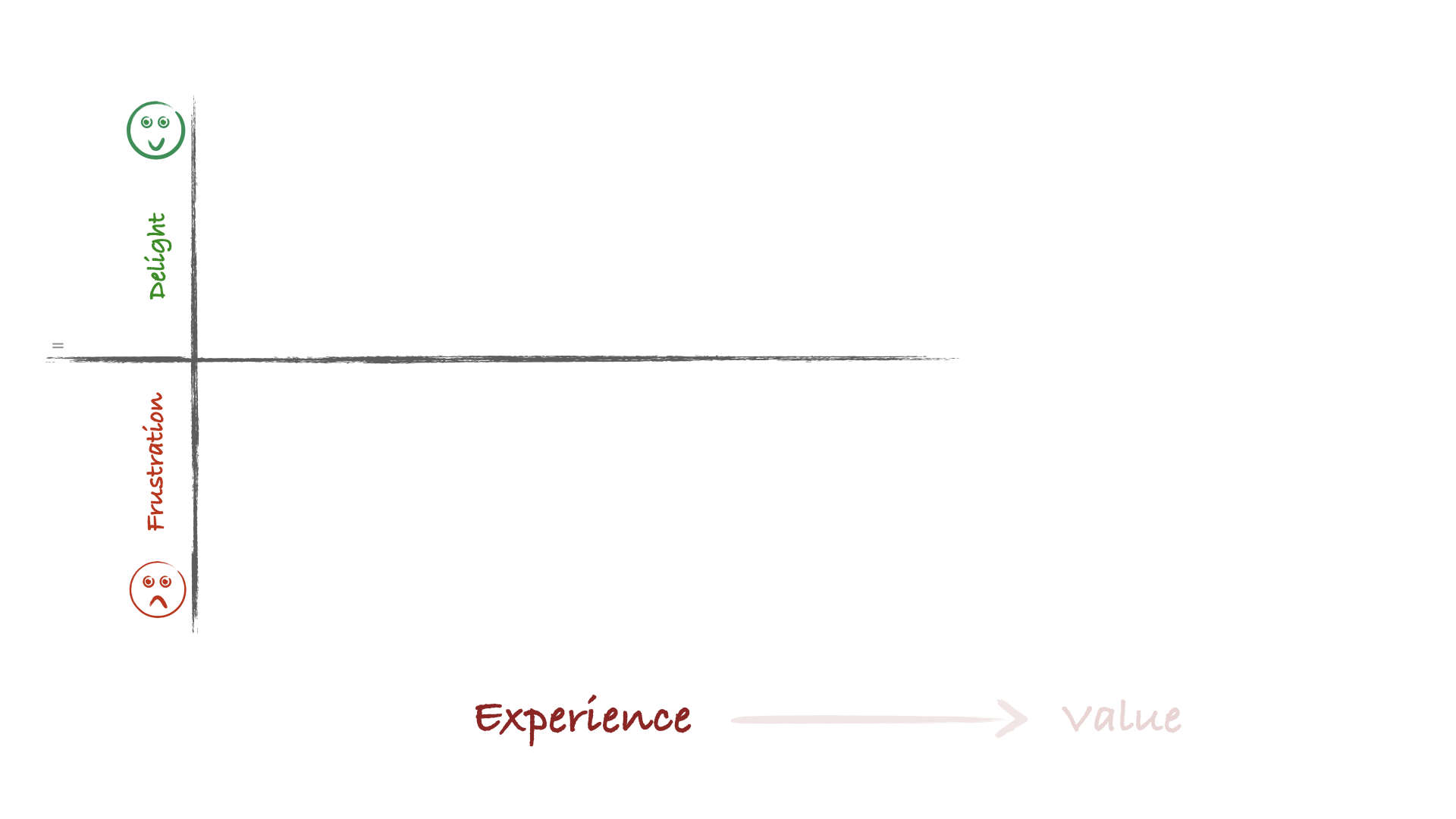
Above that line in the middle is where a user is delighted during their experience. Below the line is where they’re frustrated.
We can call that region below the line as Poor UX. Poor UX is caused by missed user expectations and unmet user needs.
The users expected things to work a certain way, and they don’t. That’s frustrating.
Or they have specific needs, and the product or service isn’t meeting them.
User frustration is almost always caused by missed user expectations and unmet user needs. (Of course, if we’re unaware of the users’ needs and expectations, we’d never know they’re having a poor experience.)
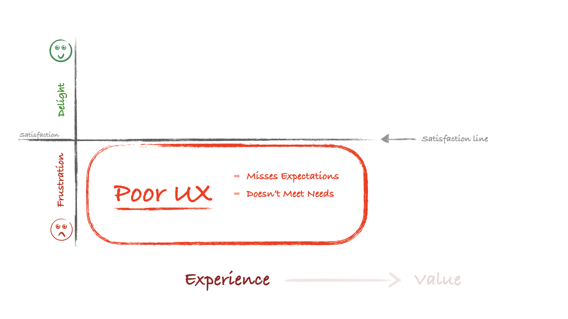
There’s a line between the regions of frustration and delight. We call it the satisfaction line. It’s neither frustrating nor delightful. It’s just OK.
(This is what satisfaction surveys measure. It’s a relatively low bar, frankly. It’s like a chef deciding the best they can do is make the food edible. We can do much better.)
Crossing the satisfaction line is a small region that hovers just above it. This region is where the user’s expectations and needs are both met. This region is what we call Good UX.
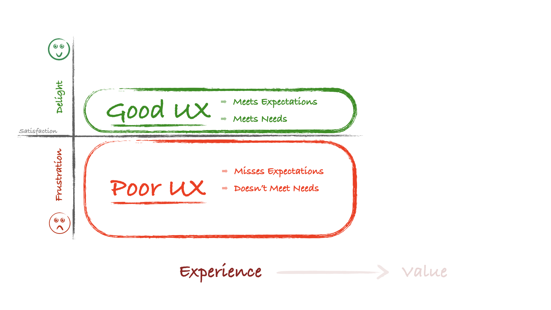
I have a toilet in my house. It does what I need it to do. It works the way I expect it to work. It never surprises me. It’s a good experience.
I’d get frustrated if it didn’t do what I needed or didn’t work how I expected. That would be a poor experience.
The thing about Good UX is that nobody gets excited about it. Nobody talks to their friends about it. I never mention how awesome my toilet is because it’s not awesome. It’s just a toilet doing what I need it to do. I’m satisfied with my toilet.
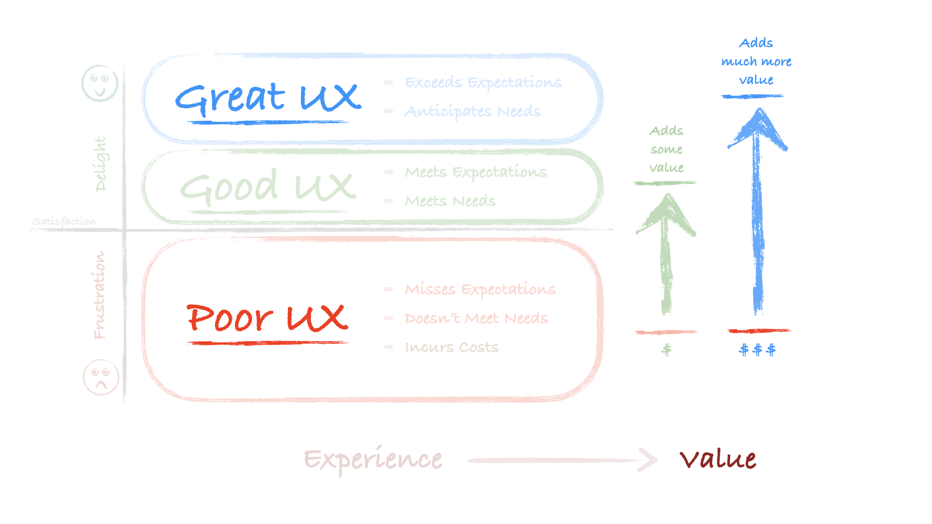
This crossover from Poor UX to Good UX is where value comes into the picture. We add value when we transform a product or service from delivering a poor experience to providing a good experience.
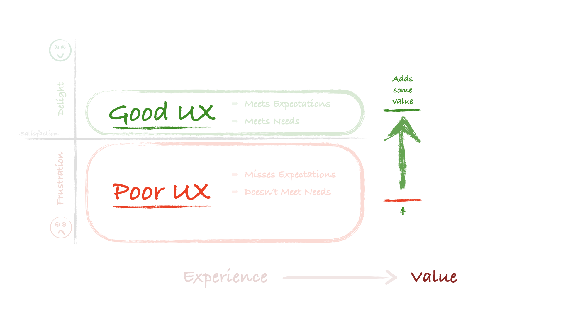
People will pay more for a better experience.
I would rather pay for a toilet that works the way I expect it to than pay for one that doesn’t meet my needs. I’m going to pay extra money to get a better toilet.
It’s valuable to transform a product or service from Poor UX to Good UX. It produces value.
People are more likely to buy it and may pay more for it. That increases sales revenue.
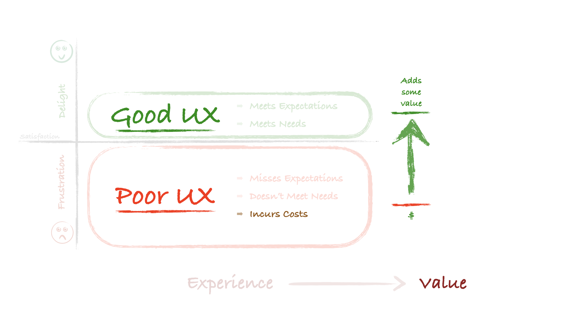
But there’s also this: Poor UX often incurs costs. A product with Poor UX has more support costs. It has more product returns and more costs to train the users. There are costs from lost productivity and developer waste. And when competitors with better quality UX appear, the product loses sales opportunities.
These are the costs of Poor UX. These costs go away when the product has Good UX.
The costs of Poor UX are eating away at the organization’s bottom line. Often in ways that executives don’t see.
However, when you point these UX-related costs out, executives can see how much money the organization spends daily on Poor UX. Making those enormous costs disappear can become a compelling incentive to invest in Good UX.
When you reduce costs and increase revenue, you increase UX’s contribution to the organization’s bottom line. This contribution increase will catch the attention of your executives and senior stakeholders. You’ve created value by improving the experience.
However, we can go further.
You don’t have to meet your users’ expectations. Instead, you can exceed their expectations.
Nor do you have to meet your users’ needs. Instead, you can anticipate their needs.
Have you ever used a product that surprised you by being easier or better in some way? You didn’t expect it to be that good. It exceeded your expectations.
Or have you ever started using a product you didn’t think you needed, but once you had it, you realized you loved it and never wanted to go without it again? That product anticipated your needs.
This realm is Great UX.
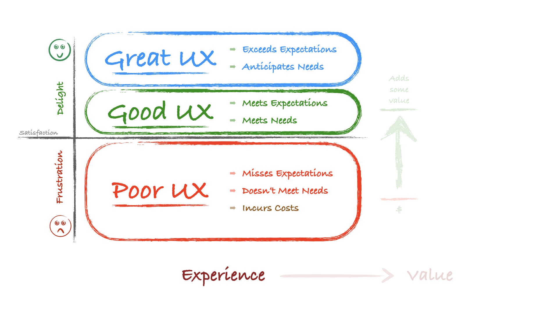
Great UX happens when you exceed what users expect from your product and what customers say they need from you. It’s when you deliver something even better than their expectations.
When you deliver great UX, you provide real value. This transformation is the secret behind companies like Apple or Disney. They focus on exceeding users’ expectations and anticipating their customers’ needs.
People talk about when they get Great UX. They tell their friends and colleagues. They write reviews and film their “unboxing” experiences. Great UX is remarkable, unlike Good UX, where nobody says anything. (People do talk about Poor UX, but that’s not good.)
Great UX is what makes you a market leader. It’s what gets people to call you an innovator. Everyone in your industry will wish they could have built what you built.
The competition will try to copy what your product offers. However, because your competitors are copying the implementation, not the experience it creates, they’ll likely get it wrong. (Like you did when you copied your competitors and delivered Poor UX instead.)
Customers will pay substantially more for products and services that deliver Great UX. Your products and services will contribute significantly to your organization’s bottom line. You’ll have created immense value.
This diagram is how I walk executives, senior stakeholders, and others through how the value of UX contributes to the organization. When I build it in front of them, they can see how moving from Poor UX to Good UX and then on to Great UX is the path they want to take.
This diagram is my gift to you. However, it’s still missing an essential ingredient. To finish it, you’ll want to answer some critical questions:
Where is your organization delivering Poor UX today to customers and users?
- Which customer and user expectations are your products missing?
- Where do your products stop short of meeting customers’ and users’ needs?
- Where are you incurring costs in your organization because your products have a Poor UX?
Where could you deliver a Good UX to your customers and users?
- Which customer and user expectations would your product need to meet?
- Which needs would your product need to accommodate?
- How much would it be worth to your organization if you met your customers’ needs and users’ expectations?
How might you deliver a Great UX to your customers and users?
- How would you exceed your customers’ and users’ expectations?
- How would you anticipate their needs?
- How much more would it be worth to your organization if you exceeded your customers’ expectations and anticipated your users’ needs?
You’ll want to fill in the diagram with these answers. The finished diagram is how you’ll demonstrate how your UX efforts directly contribute to your organization. You’ll use this to show your executives and senior stakeholders where Poor UX costs your organization and where Great UX could provide substantial value.
You’re the UX leader who will illustrate how great experiences create immense value. Now, you have a diagram of a framework to do just that.
UX Leadership and Influence program
(Formerly called the How to Win Stakeholders & Influence Decisions program.)

Our 16-Week program guides you step-by-step in selling your toughest stakeholders on the value
of UX
research and design.
Win over the hardest of the hard-to-convince stakeholders in your organization. Get teams to
adopt a
user-centered approach. Gain traction by doing your best UX work.
Join us to influence meaningful improvements in your organization’s products and services.
Learn more about our UX Leadership and Influence program today!