
Surprises on the Web: Results from Usability Testing
We recently conducted a pilot research study to find out what makes a web site usable. The results are still preliminary, but we thought you might like a peek at some of the findings that surprised us during our usability testing.
“Simple” Comparison Isn’t!
We were surprised by how hard it was to compare simple facts on the web. We asked users to compare facts (Which vehicle has the better rebate: the Geo Tracker or the Isuzu Rodeo?) on sites that had all the necessary information.
Users found these tasks frustrating; our randomly- chosen test sites were not designed to facilitate comparisons. To compare two facts, users would look up one piece of information and either write it down or print it out, then look up the other. Users did not have strategies for showing both facts on the screen at once, and the browser they were using (Netscape) didn’t make it easy.
The ease or difficulty of comparing simple facts affected the users’ perception of the site as a whole. All the sites we tested appeared less complete to users immediately after they attempted tasks involving fact comparisons, and they also rated the quality of information lower for the site. Conversely, the better users did on the comparison tasks, the better they liked the site.
Previous and Back Aren’t the Same
We found an interesting conflict between the conceptual models used by Netscape and several of the sites we tested. The web designer had created a linear structure using Next and Previous links to take users through a sequence of pages.
In contrast, Netscape employs a conceptual model that says that any user-initiated link is a step forward, regardless of what it’s called, and the Back button retraces the links the user followed. The moment the user clicks a Previous link, these conceptual models diverge. At this point, does the Back button take you one page further back in the site structure, or to the last page you accessed? Our experienced web users struggled with this distinction and often ended up somewhere they didn’t expect.
Within-Page Links Confuse Users
Some web pages had a table of contents at the top containing links to points within the page. If a user navigated through a page by scrolling, the web browser didn’t know that the user had effectively “visited” these within-page links, so it didn’t change the color of these links in the table of contents. We watched users scroll through a page, return to the top and click one of the within-page links, not expecting it to take them down the page to material they had just seen.
Animation Causes Delays
We thought that animation might slow down users by distracting their attention as they worked on the information-gathering tasks. Animation did seem to cause delays in the users’ performance, but not for the reasons we expected.
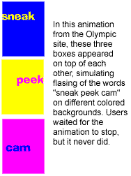
The animations at the sites we tested were achieved by repeatedly displaying a series of images to simulate movement. As far as we could tell, users ignored the content of the animations, but they would sometimes sit and wait through several complete cycles—up to several minutes—for the page to finish displaying. It never did, of course! Also, if a user did click somewhere else on the screen during the animation, as often as not, their click would be ignored. Users became frustrated and impatient.
Imagemaps Cause Navigation Problems
Two sites used imagemaps as tables of contents for the site, with scaled-down versions of the maps as navigational aids at the top of each page.
We were surprised to see users confused by these second-level maps. Users did not always know where they were, so they would click on the map section they were already in. In some cases, this took them several levels up in the hierarchy, further from the answers they were looking for. We wonder whether a more explicit “You are here” indicator might have alleviated this problem.
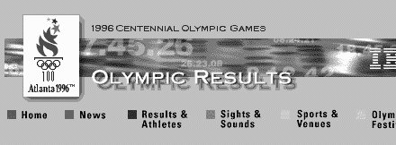
In the Olympics site, users would click on Results & Athletes, not realizing they were already there!
Frequent Jumps Aren’t Bad
We recorded the number of jumps (link transitions) users made per minute. Users averaged about .6 jumps per minute for all tasks. We found an interesting correlation between the jump rate and several subjective measures of a site. When users made more jumps during a task, they felt better at the end of the task, and they had a higher perception of the quality of information at that site.
If this finding holds true in other studies, it could mean that jump rate (which is objective and easy to observe) is a good proxy for measuring a site’s effectiveness.
It isn’t clear exactly why a higher jump rate seems to be a good thing. However, the higher the jump rate, the less time the user is spending on any one page. The faster a user can look at a page and decide whether or not it has the information they want, the faster they will be able to find that information. Therefore, a high jump rate may imply that a site presents its information content clearly to users.
Violating the “Sales Script”
Human-to-human sales situations are based on decades of slowly-evolving social conventions. If the design of a virtual store disregards these conventions, the site can pay a steep price in lost sales.
In a physical store, the “sales script” is that the shopper is allowed to browse, examine items, and check prices without giving any personal information to the store’s employees. In fact, employees are the ones who wear name tags. Only after the shopper has decided to purchase do they give the salesperson their name, address, and credit card number.
The Travelocity site violated this sales script by requiring users to fill out a form with personal data before giving them access to the part of the site containing airline flight and price information. There was a Guest option that presented the same form but told the users they only had to enter their name and e-mail address.
This tactic proved to be a deal-breaker, driving users away from the site. Although we didn’t expect users to like it, we were surprised at how strongly they resisted entering personal information up front, even when we told them that they could use an identity we provided. As one user put it, “I could lose money. This is scary. If I’m just getting information, I shouldn’t have to log on.”
UX Leadership and Influence program
(Formerly called the How to Win Stakeholders & Influence Decisions program.)

Our 16-Week program guides you step-by-step in selling your toughest stakeholders on the value
of UX
research and design.
Win over the hardest of the hard-to-convince stakeholders in your organization. Get teams to
adopt a
user-centered approach. Gain traction by doing your best UX work.
Join us to influence meaningful improvements in your organization’s products and services.
Learn more about our UX Leadership and Influence program today!