Developing a Designer’s Sense of Touch
“Here I am, a mobile touch screen guru, and I can’t even make my ATM machine work,” Josh Clark, author of Tapworthy, told me as we were discussing the difficulty of using Bank of America’s touch-based automatic teller machines. The touch interfaces on those devices regularly fall out of calibration, making them frustrating to interact with.
Since the introduction of Apple’s iPhone, touch has become a common input mechanism in people’s lives. Yet the technology for touch base has been around for decades.
My First Touch
I worked on my first touch displays in the 70s, developing kiosk technology that would eventually be employed in places like Disney’s EPCOT center. Back then, the technology was clumsy, often losing calibration and not supporting anything but a single hard push.
You couldn’t do simple swipes or drags, because the input device couldn’t keep up with the movement and the processors weren’t fast enough to have the screen cursor keep up. It’s weird to drag your finger across the screen with cursor’s movements lagging seconds behind.
The Birth of Direct Manipulation
Back then, we were limited to what we could do with touch. But touch wasn’t the only constrained technology. Before the mouse was made popular from the introduction of the Macintosh in 1984, we used keyboard commands to move around the screen. Arrow keys were often positioned in inconvenient configurations, so shortcuts, like control-D to move left and control-E to move up were common.
Our users learned these interactions in training, often through drill-and-practice lessons, or by reading manuals and practicing on their own. There was no way, back then, to pick this stuff up by just staring at the screen. (Some applications, like Wordstar, used valuable screen real estate for permanent explanations on how to move the cursor around.)
Once the mouse came along, we could, with a twitch of the wrist, move a pointer across the screen instead of repeatedly hitting arrow keys. We could select an object with a click and, in advance cases, drag it to another place on the screen.
This was the birth of direct manipulation. The irony is that we now know it isn’t that direct. You’re moving an object on the table surface to control a remote cursor on a screen. It’s worlds different from just reaching up and touching.
(I remember, In the early days of the mouse, asking new users to do things in usability tests, like “press the close button” only to see them take their hand off the mouse and actually press on the screen. Alas, this didn’t really do anything except confuse the poor user further.)
Touch Gestures Amplify the Discoverability Problem
Even though what we could do in the early touch and mouse days were limited, we still had trouble showing users what they could do. After all, if you didn’t know you could drag the disk icon into the trash can to eject your disk from the drive, how would you learn that? This problem hasn’t gone away, in fact, it’s gotten worse with the new touch technology.
“We have a broad problem with discoverability,” Josh told me in our interview. “Gestures are not labeled. They are invisible. You have to find them.”
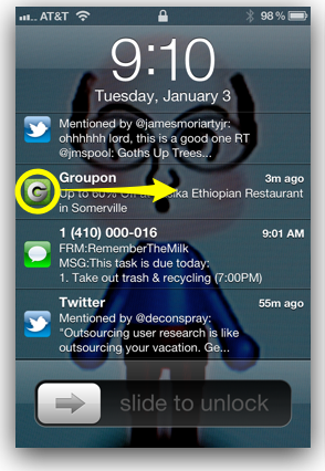
For example, most users of Apple’s new iOS5 operating don’t realize they can swipe the icon in the lock screen’s notification list to open that application directly. It’s not something you’d learn without being told.

Having complex gestures as shortcuts work fine, as long as users can get by without knowing them. When Twitter recently updated their iOS native application, frequently used features, such as direct messages moved from the main navigation to a sub screen. There was no way for the regular user to discover the hidden gesture to open the direct message screen.
The discoverability problem is amplified as the number of gestures increases. Designers will need to carefully balance their desire for gesture-based controls against making a feature visually obvious. Users enjoy shortcuts, but only if they know they exist.
Skeuomorphism That Frustrates
When a new input technology becomes affordable, it opens up a world of possibilities. The first experiments often involve copying familiar attributes with the new device.
When the computer mouse and the graphics display became inexpensive enough to be standard on every computer, we saw experiments like this. Microsoft Bob, for example, tried to make file manipulation “natural” by giving users a picture of a multi-drawer office file cabinet to manipulate. Southwest Airlines experimented on their first web site with a picture of a ticketing desk and travel agent users manipulated with the mouse.
Making copies of real-world elements is known as skeuomorphism. The intent is to deliver something familiar and comfortable to the user.

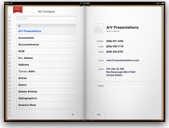
The problem with skeuomorphic interfaces, Josh tells us, is they often aren’t designed to behave like their real-world counterparts. Take the Apple iOS Contact Book application, for example. “It looks like a book,” Josh exclaimed, “but doesn’t let you turn the page like a book.” Users bring expectations to how the real world representation should behave.
“It’s not just eye candy,” Josh tells designers. “You have to follow through on your interface metaphor.” Skeuomorphic designs can work, but they have to mimic many of the features of the designs they pretend to be.
Defining a New Vocabulary
As designers are experimenting with what all these new touch gestures can do, we see a language emerging. For example, on Apple’s devices, they introduced the horizontal-swipe-to-delete gesture in the applications that come with the phone. Many designers have adopted this gesture for similar delete operations.
However, Josh points out that, because applications are appearing on the scene so quickly, we’re seeing conflicting gestures. “You have to learn different gestures to read a magazine in different magazine apps,” he said. “Conde Nast and Time, you need to get together on this.”
Josh sees a time of confusion before we see a standardization of gestures across applications. He recommends designers become very aware of what others are doing before they invent a new gesture. It’s possible someone else already has a way to indicate the same functionality.
There’s an opportunity to catalogue what’s already been done. “Something I’ve been wanting to do for some time is to start putting together a gesture pattern library,” Josh told me. “How could we start to use a collection like that?”
UX Leadership and Influence program
(Formerly called the How to Win Stakeholders & Influence Decisions program.)

Our 16-Week program guides you step-by-step in selling your toughest stakeholders on the value
of UX
research and design.
Win over the hardest of the hard-to-convince stakeholders in your organization. Get teams to
adopt a
user-centered approach. Gain traction by doing your best UX work.
Join us to influence meaningful improvements in your organization’s products and services.
Learn more about our UX Leadership and Influence program today!

