
Responsive Design for Apps

Originally published on the Cloud Four Blog on January 3, 2013.
A few months ago I was tasked with finding a good solution for a client who wanted to move to responsive design, but had a web app that they needed to support as well. The question they asked is one that I’ve seen others argue about in the past: does responsive design make sense for apps?
In this case, the client was using a JavaScript UI framework from Telerik. This framework has been deprecated in favor of Kendo UI.
Kendo UI follows a pattern that I see for many of these frameworks: there are desktop widgets and mobile widgets. The same is true of nearly every framework that I could find:
- jQuery UI and jQuery Mobile UI
- Sencha Touch and Sencha Ext JS
- Dojo desktop “Dijit” widget library and Dojo Mobile
The pattern seems clear at least from a framework perspective. There are widgets for desktop web development and widgets for mobile. They look and behave differently.
But does that make sense? Is that where things will head in the long run?
Why Aren’t These Frameworks Responsive?
I know within these frameworks, that portions are responsive. jQuery Mobile, for example, is designed to be responsive. But there is still a separation between the mobile/tablet UIs of jQuery Mobile and the desktop widgets of jQuery UI. Why is that the case?
When it comes to Kendo UI, we know what the developers are thinking. They wrote about their thoughts on responsive design back in September:
Responsive design is great for creating mobile sites, but it’s not as useful for creating mobile apps. Responsive design can help you hide, show, resize, and reformat UI for screens of varying size, but it is less suited for presenting completely different modes of usability on different form factors.
On the face, it seems like a reasonable enough argument. But what stuck in my craw was something else they wrote about why they have a separation of tablet UI versus phone UI:
It’s not that we’re technically incapable, but adapting a phone UI to a tablet UI is not so dissimilar from trying to automatically adapt desktop UI to a phone. They are fundamentally different platforms with different usability considerations, and something that makes sense on phones may or may not belong on tablets.
These two sentences struck me as odd and difficult to reconcile with what we’ve seen happen in the market over the last few months.
Where is the Line Between Tablets and Phones?
So what separates a phone from a tablet? I’m going to assume they’re not talking about the fact that one can make phone calls and the other cannot.
In truth, I don’t know why the Kendo UI folks think the platforms are different1 . What I can say is that when the iPad came out, the lesson was clear that simply increasing the size of an iPhone app to make it fit on a 10″ screen was not sufficient. And since then, I’ve heard a lot of people talk about how tablets are different than phones.
So let’s assume for a second that the major difference is screen real estate because so many other things are similar (touch screens, operating system, etc. are all consistent between phones and tablets). Let’s take a closer look at screen real estate:
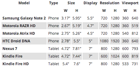
In the table above, I’ve picked some of the larger phones and smaller tablets. It seems that phones stop at around 5 inch displays and tablets pick up at 7 inches. So there is a gap in physical size between the two device classes-even if that gap is getting smaller over time.
But for web developers, the screen resolution-and more specifically the viewport size-make a bigger difference than the physical size. And when it comes to viewport size, the differences between tablets and phones are less clear.
Quick, without looking at the table above, identify which of the following viewport measurements belongs to a phone and which belongs to a tablet:
- 640 px
- 600 px
- 519 px
- 640 px
- 622 px
- 533 px
- 812 px
Can’t Tell the Difference Can You?
Those of you paying close attention will notice that I used the widths of tablets and the heights of phones. Now before you accuse me of cheating, do you really think no one uses their phone in landscape orientation?

Is Tablet UI Different than Phone UI?
So it is true that phones and tablets “are fundamentally different platforms with different usability considerations, and something that makes sense on phones may or may not belong on tablets”?
Fundamentally different? With the exception of the ability to make a call, the data suggests that they’re aren’t so different and that the differences between phones and tablets are narrowing all the time.
Ok, But Desktop UI is Definitely Different, Right?
Surely desktop is different, right? Every JavaScript framework that I looked at makes a distinction between mobile and desktop. Even Apple has different SDKs for iOS and OS X.
This seems to be the common opinion particularly when it comes to building intranet or enterprise applications that “will only be used on desktop”.
Earlier this year, my friend Boris Smus made a compelling argument for why web apps need more than media queries:
To create a good user experience, you need to know who your users are and what devices they are using. If you build a user interface for a desktop user with a mouse and a keyboard and give it to a smartphone user, your interface will be a frustration because it’s designed for another screen size, and another input modality.
I highly recommend reading Boris’s article because he does a good job of describing a method for classifying devices into form factors not based on whether they are sold as a “phone” or a “desktop computer”, but instead based on the characteristics of the device. Boris offers a middle ground between responsive design and separate code bases for every device:
Here’s a compromise: classify devices into categories, and design the best possible experience for each category. What categories you choose depend on your product and target user. Here’s a sample classification that nicely spans popular web-capable devices that exist today.
- small screens + touch (mostly phones)
- large screens + touch (mostly tablets)
- large screens + keyboard/mouse (mostly desktops/laptops)
This made a lot of sense to me at the time. Designing a complex application that is finely tuned to keep someone in the flow while working with a keyboard and mouse is different than designing something tuned to touch.
That is, it made a lot of sense to me until…

Windows 8 Obliterates the Distinctions Between Tablets and Desktop
Jeremy Keith once wrote that web design was always full of a bunch of unknowns including things like screen size, but that web designers had:
This unspoken agreement to pretend that we had a certain size. And that size changed over the years. For a while, we all sort of tacitly agreed that 640 by 480 was the right size, and then later than changed to 800:600, and 1024; we seem to have settled on this 960 pixel as being this like, default. It’s still unknown. We still don’t know the size of the browser; it’s just like this consensual hallucination that we’ve all agreed to participate in: “Let’s assume the browser has a browser width of at least 960 pixels.”
I’ve always loved this idea of a consensual hallucination that all we all agreed to participate in. I still remember nervously presenting work to clients or bosses and hoping that they had their browser set to the default font. I crossed my fingers and hoped they also believed in the hallucination that people didn’t adjust the font size in their browser.
I bring this up because we have a similar consensual hallucination about the distinctions between tablets and desktop. At the same event that Steve Jobs introduced the iPad, he also unveiled the iPad Keyboard Dock.

How many people have you seen carrying an iPad case with a built-in keyboard? I was in a meeting recently where nearly everyone in the room had iPads with keyboards.
Yet, in our collective hallucination, we believe large screen and touch equals tablet whereas large screen plus keyboard and mouse equals desktop.
Jeremy points out that mobile didn’t create more unknowns for web designers. It just forced us to recognize the unknowns that were already there.
The same is true of Windows 8. Our illusion that there are sharp differences between tablets and desktop is destroyed by a whole slew of devices that can change between tablets and desktop machines on a whim.

And it’s not just these laptops/tablet hybrids that break our preconceived notions of what desktop means. Many manufacturers are also producing Windows 8 desktop computers that feature touch screens. Or touch screen monitors that can be added to any Windows 8 machine.

And just to confuse things further, Ubuntu is introducing phones that act like desktop computers when docked.
Touchscreens on Desktop are Just a Fad, Right?
I’ve seen a fair amount of criticism of Microsoft for incorporating touchscreens into their laptops and desktop devices. Jon Gruber wrote:
A touch-optimized UI makes no more sense for a non-touch desktop than a desktop UI makes for a tablet. Apple has it right: a touch UI for touch devices, a pointer UI for pointer (trackpad, mouse) devices. Windows 8 strikes me as driven by dogma – “one Windows, everywhere”.
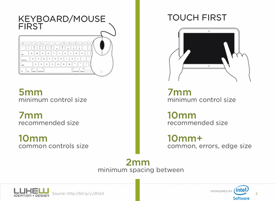
Windows 8 may not have all of the pieces worked out yet, but I believe they are on the right track and Apple will follow suit at some point. Intel has published detailed findings of their usability studies of touch on notebook computers:
Users who were presented with a way to interact with their computers via touch, keyboard, and mouse found it an extremely natural and fluid way of working. One user described it using the Italian word simpatico-literally, that her computer was in tune with her and sympathetic to her demands.
They go on to dispute the conventional wisdom that people get fatigued using touchscreens. The people who I’ve talked to who have Windows 8 touchscreens talk about how natural it is and how quickly they stopped thinking about it and just flow from using their trackpad or mouse to touching the screen. They say simply, “Don’t knock it until you try it.”
And really, why wouldn’t this be true? We’ve seen children who are confused that computer screens don’t respond to touch the same way the other screens around them do. We laugh at ourselves when we absentmindedly reach out and touch our screen expecting it to do something.
We call these touch interfaces natural user interfaces. Is it any surprise then that we would want these interfaces on our desktop machines as well?
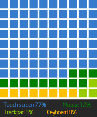
Touch as a Baseline Experience
Luke Wroblewski has neatly summarized our current device landscape in a single graphic:
We have devices at nearly every screen size and we have multiple types of input at each resolution. The small gaps that exist are either things that seem inevitable (high-dpi on large screens) or are so small to be inconsequential (does it matter that we don’t have six inch displays?).
Luke produced an under-appreciated series of videos for Intel that take a closer look at what it means to design applications for these new class of touch laptops. In that series, he looks at what it would mean to design for targets for mouse versus touch:
In the video, Luke makes the point that an app designed with targets appropriate for a keyboard/mouse UI will be difficult for someone to interact with using touch. But the opposite isn’t the case. If targets are designed for touch, they will by necessity be larger and will be easier for all users to hit due to Fitt’s Law.
Josh Clark came to a similar realization recently and argues that Every Desktop Design Has To Go Finger-Friendly.
To me, it seems like nearly every lesson we’ve learned about designing for mobile and tablets-whether it is designing larger targets for touch, using larger typefaces for readability, or simplifying interfaces-are things that desktop applications can benefit from. And this is why you see both Apple and Microsoft incorporating the lessons learned from mobile into their desktop operating systems.
Perhaps in the past desktop UI was something completely different from mobile UI, but that is no longer the case.
Lines in the Sand Do Not Persist
Any attempt to draw a line around a particular device class has as much permanence as a literal line in the sand. Pause for a moment and the line blurs. Look away and it will be gone.
Let’s take the absolute best case scenario. You’re building a web app for internal users for whom you get to specify what computer is purchased and used. You can specify the browser, the monitor size, keyboard, etc.
How long do you think that hardware will be able to be found? Three years from now when a computer dies and has to be replaced, what are the chances that the new monitor will be a touchscreen?
By making a decision to design solely for a “desktop UI”, you are creating technical debt and limiting the longevity of the app you’re building. You’re designing to a collective hallucination. You don’t have to have a crystal ball to see where things are headed.
And once you start accepting the reality that the lines inside form factors are as blurry as the lines between them, then responsiveness becomes a necessity.
I’m not saying there isn’t usefulness in device detection or looking for ways to enhance the experience for specific form factors and inputs. This isn’t a declaration that everything must be built to be with a single html document across all user agents.
What I am saying is that even in scenarios where you’re fine-tuning your app code and UI as much as possible for a form factor, that the differences in screen size and the various forms of input within a form factor alone will be enough to require you to design in a responsive fashion.
And once you start designing in a responsive fashion for a given UI widget, you’re going to find that you have to think about what happens to that widget across a wide range of screen resolutions.
To do otherwise means ignoring the reality of our device landscape and requires you to buy into a collective hallucination.
This is your last chance. After this, there is no turning back. You take the blue pill- the story ends, you wake up in your bed and believe whatever you want to believe. You take the red pill- you stay in Wonderland, and I show you how deep the rabbit hole goes.
Continue reading in Part 2
- I worry that it will seem like I’m picking on the Kendo UI folks, but that isn’t what I set out to do. It just so happens that our client was using their tools and my investigation started with their framework. Their article on responsive design spurred a ton of thought which I’ve captured here. FWIW, I think the tools they provide are pretty damn cool, and we’re all still grappling with what Windows 8 means for us.
- Finding viewport sizes for all of these devices proved difficult. If there is an error, please let me know.
UX Leadership and Influence program
(Formerly called the How to Win Stakeholders & Influence Decisions program.)

Our 16-Week program guides you step-by-step in selling your toughest stakeholders on the value
of UX
research and design.
Win over the hardest of the hard-to-convince stakeholders in your organization. Get teams to
adopt a
user-centered approach. Gain traction by doing your best UX work.
Join us to influence meaningful improvements in your organization’s products and services.
Learn more about our UX Leadership and Influence program today!