The Power of Sketches: How We Sold a Huge Project Shift with 5 Index Cards
This article was originally published on the Eightshapes web site on July 18, 2012.
Last year, EightShapes was engaged by The Heritage Foundation to create a publicly accessible online version of their published book, The Guide to the Constitution.
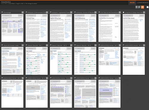
A few weeks into the process, we’d brainstormed a bit and iterated a few times on a HTML prototype. The emerging design took a “classical” approach: home page with spotlights targeting varied tasks and audiences, standard article template for the Guide’s many essays, a powerful search, and a deeper page to read the whole Constitution text. The following grid of page layouts expresses the quick—yet comprehensive—prototype we started with.

Due to scheduling constraints, we convened a sketching design studio with the foundation’s web team and sponsoring stakeholder group a bit later in the process than desired. Little did we know that the studio and follow-up brainstorming would lead to a dramatic change in direction.
The Closing Standup: Sensing a Theme
The studio started with ideas around search results and indices, articles and amendments as chapters, and even essays as “the key article” content type. By the conclusion, there were a ton of ideas to consider.
To close the studio, we gathered the whole group—4 stakeholders, 4 web team members, and 2 EightShapes designers—into a circle to wrap up. The circle provided an opportunity for each person have a moment to voice the design ideas they felt were most important.
Everyone had their turn, and each held a sketch of theirs aloft. Each explanation described a different way to slice navigation so as to “explore the Constitution this way.”
Some felt very strongly—even passionately—about their ideas. To design an experience incorporating all those ideas would result in a very complex UI of many page types and layouts, just like the earlier prototype. However, the comments did share a common theme: navigating around the Constitution was like poking around the problem. They wanted to interact with the document itself.
Next Step: The Followup Mini-Studio
Days after the studio with the client, I convened with my design teammate James to consolidate and prioritize the ideas. We reserved two hours to devise a plan sufficient enough to bring our UI design project to conclusion.
We culled through sketches, organized the stack, and began “sketching consolidation:” sketching concepts to unify themes consistent with the studio’s consensus on layouts, navigation, labels, and more.
Then I perturbed our steady progress by asking “What if we put the Constitution at the center and made this more of an app, sorta like Twitter for iPad?”
The Big Idea: The Constitution as an Interaction Hub
In UI terms, this is referred to as “let the content be the interface.” How can we create an interface that focuses on the Constitution itself, wrapping all of the different ways to slice it—articles, amendments, search, specific passages, paths to essays, etc—around or into the document?
The document would have to be far more interactive. It’d dominate the view, front and center.

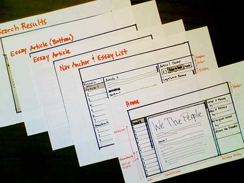
I sketched a 2—3 grid of all page types of the experience over 5-10 minutes, narrating to James as I drew. Admittedly, I began getting passionate about the idea, and used James as my “reasoning” sounding board.
The concept was a dramatic shift from anything prototyped, discussed, or even sketched during the studio. It was safe to say: the client had never seen this before. To introduce this idea at this stage risked shaking things up and requiring yet another presentation that convened the stakeholders.
As the flourish concluded, we had to make a decision: do we share this idea, risk the implications that we start prototyping again from scratch, and have to “re-sell” an idea, again? Or, do we play it safe, stick with concepts everyone already knew?
With sketching, we could propose both.
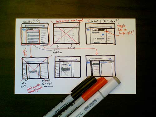
So, I closed out our two hours together with 20 minutes sketching the three critical (and, actually, only) page types of the new concept: Constitution, Essay, Search Results.
The Pitch: Five Minutes, Sharing Sketches Remotely
Shortly thereafter, we met with the web team to discuss the plan to finish the project. Following a minute of “where we are” context, I facilitated a five minute design review of the new idea.

The walkthrough was remote, presenting the sketched pages successively live using the IPEVO document camera’s image transmitted via a GoToMeeting’s shared screen.
The presentation was quick, tight, and—no pregnant pause necessary—the astute client bought off on the idea immediately. Knowing we needed a bit more time to explore the idea, I acknowledged the need for more budget to prove the concept via a new prototype.
The client approved. We prototyped. The concept shined.
Epilogue: Selling More than a Prototype
Ultimately, the sketch and prototype sold our internal advocate on the concept, an idea we were able to jointly sell to the remaining project stakeholders. From that kernel of an idea—revealed in sketch form—EightShapes was engaged to complete the visual design, create front end templates, and script the entire front-end layer.

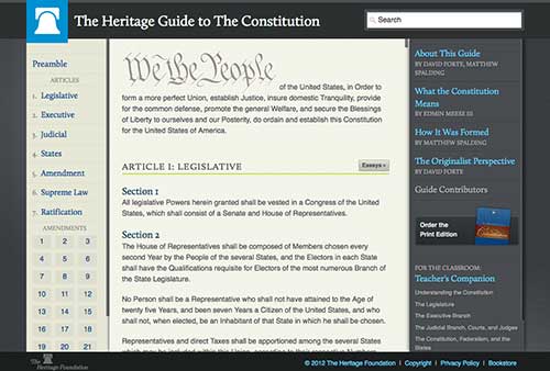
The app launched in Spring 2012 at heritage.org and—per the unanimous sentiment of the team involved—represents one of the more rewarding efforts we’ve had.
UX Leadership and Influence program
(Formerly called the How to Win Stakeholders & Influence Decisions program.)

Our 16-Week program guides you step-by-step in selling your toughest stakeholders on the value
of UX
research and design.
Win over the hardest of the hard-to-convince stakeholders in your organization. Get teams to
adopt a
user-centered approach. Gain traction by doing your best UX work.
Join us to influence meaningful improvements in your organization’s products and services.
Learn more about our UX Leadership and Influence program today!

