
iPhone App Design: When an Awkward Interface Makes Sense

This article was originally published on O’Reilly Answers, October 2010.
Awkward isn’t always bad. The ease and sensitivity of touchscreen interfaces can also work against you. When it’s too easy to trigger an action, mishaps ensue. Unlocked phones fire off surprise calls from handbags and back pockets. We carelessly delete important data by tapping the wrong item. Call it touchscreen self defense: by requiring awkward or challenging gestures at well-placed points of your interface, you can protect against miserable mistaps.
Apple gives you an example of this technique in the very first screen it shows to new iPhone owners. The “slide to unlock” control greets you when you fire up your new toy for the first time. That sliding action requires just enough concentration and precision to make it unlikely to unlock the phone accidentally from a backpack or purse. Ditto for the “slide to power off” and “slide to answer” controls you get when turning off the phone or receiving a call. All of these slider controls demand extra attention, defending against accidental tapping and helping to ensure it’s actually a person doing the work, not the phone rattling around in your bag.
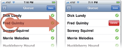
The swipe-to-delete gesture uses the same sliding action to offer protection against accidentally deleting items in a table view. By requiring a swipe followed by a tap on an item’s Delete button, the operation demands just enough focus to offer protection without being annoyingly onerous. That gesture is a shortcut for a longer triple-tap combination (Edit button, delete icon, then Delete button). Requiring a careful series of taps is also an effective defense, but like a lock-laden door, it can also be a frustrating hassle when you actually want to open the door. Use these multi-tap combination locks sparingly and only for relatively rare actions—or provide a shortcut like Apple did with the swipe-to-delete gesture.
The swipe-to-delete shortcut lets you delete a list item in a two-step process. Swipe left to right across the item to delete, then tap the Delete button.
Requiring extra taps or clicks is a time-honored tradition in software interfaces that aim to protect against deleter’s remorse. Since the get-go, computers have asked for confirmation when we try to throw things out. “Are you really sure you want to do that?” Apple recommends that you do that, too, by using an action sheet to throw up a confirmation screen. This nagging approach is rarely effective, however, and is typically annoying more than helpful. Over time, people also develop an immunity to confirmation screens, tapping through them without giving them much thought. They’re too easy to dismiss, too annoying to heed. (Even Apple offers the option in the built-in Mail app to turn off the confirmation message when deleting messages.) Still, the underlying idea of confirmation screens is sound: good interfaces make you work just a little bit harder to do something you might otherwise regret later. Using an awkward gesture or a multi-tap combination can do the job just as well as a confirmation screen but without the annoyance.
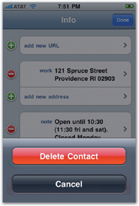
In Contacts (below), an action sheet is used to confirm the deletion of a contact, a last-chance fail-safe against accidental deletion.
The ultimate backstop for preventing mistakes is simply to let people take it back: the undo command. There’s an emerging standard for triggering undo by shaking, but many iPhone users remain unaware of that option, and the shake gesture has lots of drawbacks of its own. A novel alternative is to offer an undo button temporarily to let people change their mind in the few seconds after they do something. Google popularized this approach on the web with its Gmail service by letting you undo a sent email message. You can’t really call back an email once it’s sent, so Gmail instead hangs onto the message for five seconds, giving you a few beats to scramble for the panic button when you realize you’ve sent that love letter to the wrong girl.
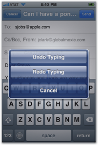
Displaying the undo/redo dialog box (below) is the emerging standard for the shake gesture.
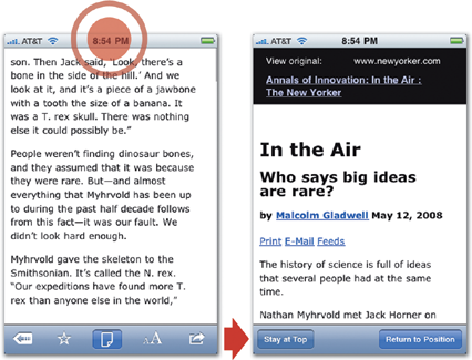
Instapaper uses a similar limited-time undo button. The app lets you store long articles from the web for later reading and saves your place in an article when you pause midway through. “I got frequent emails from customers who were upset that they had inadvertently tapped the status bar, which scrolls to the top of the article and loses their position,” says Instapaper developer Marco Arment. “I understood completely, since losing your read position is a form of minor data loss.” To address the issue, Instapaper changes its toolbar for five seconds after the scroll, offering a “Restore to position” button to take it back. It’s a good example of after-the-fact defensive design.
In Instapaper, as in most apps, tapping the status bar (left) takes you to the top of the screen (right). For five seconds afterward, Instapaper replaces its screen-bottom toolbar to offer an option to return to the previous position in the article.
UX Leadership and Influence program
(Formerly called the How to Win Stakeholders & Influence Decisions program.)

Our 16-Week program guides you step-by-step in selling your toughest stakeholders on the value
of UX
research and design.
Win over the hardest of the hard-to-convince stakeholders in your organization. Get teams to
adopt a
user-centered approach. Gain traction by doing your best UX work.
Join us to influence meaningful improvements in your organization’s products and services.
Learn more about our UX Leadership and Influence program today!