New Rule: Every Desktop Design Has To Go Finger-Friendly – Part 1
Originally published on Josh Clark’s blog Global Moxie on November 5, 2012.
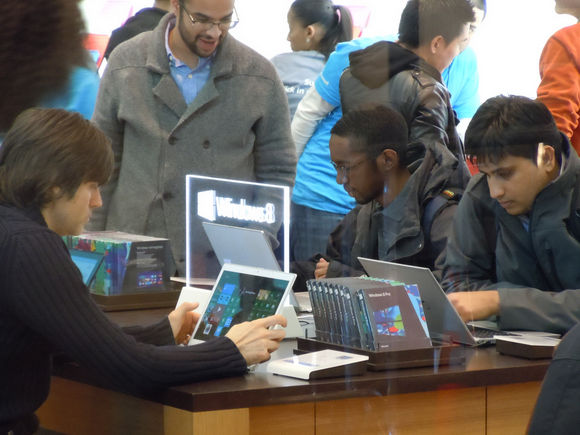
Touch has landed on the desktop. A whole new category of touch devices is flooding the consumer market in coordination with the release of Windows 8: touchscreen laptops and tablet/keyboard combos. These new hybrid combinations of touch and keyboard create a new ergonomic environment… and fresh demands on designers.
Like tablets before them, the ergonomics of these hybrid gizmos demand UI conventions that depart from desktop layouts of similar screen size. The hybrids not only need big touch targets to accommodate clumsy fingers, but they also need controls and navigation conveniently placed where hands naturally come to rest. Designing for touch introduces elements of industrial design: physical comfort and ease are critical considerations.
Unfortunately, the top-of-screen navigation and menus of traditional desktop layouts are outright hostile to hybrid ergonomics. Tried-and-true desktop conventions have to change to make room for fingers and thumbs. For now at least, the solution is not just a matter of designing separate interfaces for touch and non-touch gadgets. That won’t fly, because as designers (and especially web designers) we often don’t have enough information about the device.
After poking at this problem for a few weeks, my conclusion is: every desktop UI should be designed for touch now. When any desktop machine could have a touch interface, we have to proceed as if they all do.
Walk with me.
Gorilla Arms Get a Rest
Hybrids require us to move our hands back and forth between the keyboard and the touchscreen just behind it. Before this new onslaught of hybrids arrived, many (including a dismissive Steve Jobs) criticized the concept as untenable: people wouldn’t want to shuttle their hands back and forth to point at the screen. The effort would be too much, too inefficient, and the result would be the fatigue of “gorilla arms.” It’s a criticism leveled at Minority Report-style interfaces of science fiction, too: who wants to work with your arms constantly in the air?
Early returns suggest those initial worries were unfounded. People do embrace touch with these hybrids, but they do it by barely lifting their arms. In usability studies by John Whalen of Brilliant Experience and by Intel,1 newcomers shifted naturally to interacting directly with the touchscreen, ignoring any mouse or trackpad. Despite the availability (and greater precision) of these time-tested pointers, people said the touchscreen felt more intimate and direct. The hand became their preferred pointer for buttons, scrolling, you name it. Even expert users accustomed to tabbing between fields switched to independently selecting form fields by touch.
There seems to be something irresistible about the touchscreen, even when more precise or efficient options are available. Jeff Atwood put it nicely in his review of Microsoft’s Surface tablet:
I’ve stopped thinking of touch as some exotic, add-in technology contained in specialized devices. I belatedly realized that I love to touch computers. And why not? We constantly point and gesture at everything in our lives, including our screens. It’s completely natural to want to interact with computers by touching them. That’s why the more unfortunate among us have displays covered in filthy fingerprints…
After living with the Surface RT for a few days now, I’m convinced that this form factor is the replacement and way forward for the stagnant laptop. I can’t even remember the last time I was this excited about a computer. The more I use it, the more I think that touch plus keyboard is the future of all laptops.
But what about those gorilla arms? John Whalen’s research found that people avoid raising their arms with hybrids by instead resting them alongside the keyboard, keeping a loose grip at the bottom corners of the screen. (Among other things, this grip helps to steady a sometimes floppy laptop screen when you tap at it.)
As with any handheld touchscreen device, the way you hold the thing informs where primary controls should go. So this bottom-corner grip has important implications for the visual layout of websites and apps on hybrid devices. But first, to basics…
Rule of Thumb
Designing for touch means designing for fingers, yes, but to be more specific, you’re really designing for thumbs. On every handheld touchscreen, from phones to tablets to hybrids, the thumbs call the shots. Here’s why.
Phones: One Hand Means One Thumb
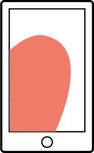
On phones, the best interfaces optimize for a one-handed grip, because it’s at once the most freeing and the most limiting. It’s freeing because it lets you do things with the other hand-write, sip coffee, hold a baby-a fact that makes it the most common grip. But it’s limiting because working a phone one-handed means working it with your thumb. Thumbs separate us from the beasts, but alas, when it comes to driving software, thumbs lack both reach and dexterity.
This is a big reason why apps and mobile operating systems pin primary controls to the bottom edge of the screen-precisely the opposite of typical desktop layouts. (It’s not only simple comfort and convenience that drive screen-bottom conventions, though. It’s also the awkward fact that fingers obscure the screen. Pushing controls below the content keeps hovering hands out of the way.)
Tablets: On the Edges
Tablets are trickier because we hold them so many different ways. We grab, tilt, lean, cradle, and clench in a whole variety of embraces, many of which depend upon stance. The rule of thumb still applies to these guys, except that the thumb zone changes. The special headache here is that the thumb zone isn’t consistent even for individual devices; it changes depending on posture.
Standing up, you use two hands to tap away on a large tablet like iPad. You likely hold it halfway up the sides for leverage (hold it too close to the bottom, and the thing goes floppy.) Or perhaps you have one arm wrapped around it like a clipboard while you tap with the other hand. Sitting at a table, you’re likely to prop a tablet with one hand at the lower third and tap with the other. Reclining in an armchair, you tend to rest it in your lap and tap with the other hand. Lying down or reclining, you rest the thing on your belly or nestled in a blanket, propping it with one hand, tapping with the other. In all of these grips, fingers fall in different places on the device.
When it comes to tablets, in other words, we’re all hands. We roam all over the things-all over, that is, except the top and bottom edges. As varied as tablet grips can be, two things are true for all of them. First, we tend to hold tablets at the sides; though the specific location wanders up and down, thumbs tend to settle at the middle- to top-third of the screen.
Second, the larger the screen, the harder it is to take in the whole thing at a glance as you can on a phone. On larger tablets, as with print design, our visual attention naturally focuses on the top of the tablet, and the design’s information hierarchy should reflect that.
These factors mean eyes and thumbs naturally occupy the top half of tablets, with thumbs straddling the edges. Spreading navigation and primary controls across the bottom-the standard pattern for phones-turns out to be ergonomically hostile on tablets. Sometimes the bottom isn’t even visible at all. In the laziest and perhaps most common of positions-lying down or reclining-the bottom bezel tends to disappear into blankets, sweaters, and soft bellies.
Tablet navigation and other frequent controls should hug the sides or top corners for easy thumb access. Avoid forcing people to lift and haul their entire arms over to the top or bottom edges for frequent touch targets. Some arm lifting is of course inevitable. Tablets are thumb and index-finger devices, with the index finger driving interaction inside the tablet’s canvas. You have to move your arm for that, no way around it, but focusing navigation around the thumb as the anchor at least means that you can spare your arm the most frequent taps. The top corners are within thumb striking distance while also remaining in the tablet’s primary visual area.
But what happens when we strap a keyboard onto the thing?
Hybrids: All Thumbs
Here again, the rule of thumb calls the shots. You’ll recall that hybrid users frequently adopt a bottom-corner grip, resting their arms alongside the keyboard. Placing primary controls and navigation in easy reach of bottom-corner thumbs means you avoid gorilla arms. The result is a vertically flipped version of the thumb zone we saw for standalone tablets.
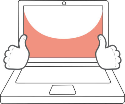
Not everyone adopts the bottom grip, though. Others (especially newcomers) go freeform, jabbing their index finger at the screen. This approach unhinges the hands from the screen edges, giving freedom to roam the interface. Still, the center of the screen tends to be an easier touch than the corners with this technique. Trouble is, this finger hot zone is exactly the reverse of the thumb zone.
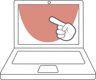
The upshot: optimizing for thumbs means a subpar experience for the index finger-and vice versa. One layout has to win, though, and as with every other touch device, the winner is the thumb. John Whalen’s study suggests that hybrid users begin to prefer thumb use over time, with expert users going nearly all thumbs, reaching them in and out of the screen from the edges to drive interaction. Once again, thumbs are the primary utility pointer.
Cluster primary controls and gestures for hybrid screens around the bottom corners and sides. That’s one reason Windows 8 uses edge gestures to summon system and app controls. A swipe from the right edge conjures the system charms, and a swipe from the bottom edge brings up a shelf of app tools.
What all of this adds up to: input type and grip should drive the placement of controls, not screen size. For web designers in particular, this is a big headache.
Read part two of Josh’s article here.
UX Leadership and Influence program
(Formerly called the How to Win Stakeholders & Influence Decisions program.)

Our 16-Week program guides you step-by-step in selling your toughest stakeholders on the value
of UX
research and design.
Win over the hardest of the hard-to-convince stakeholders in your organization. Get teams to
adopt a
user-centered approach. Gain traction by doing your best UX work.
Join us to influence meaningful improvements in your organization’s products and services.
Learn more about our UX Leadership and Influence program today!

