Design is the Rendering of Intent
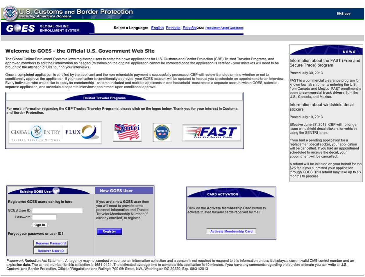
In 2008, the US Customs and Border Protection agency launched the Global Entry program, which allows pre-verified, low-risk travelers to receive expedited clearance to re-enter the United States. The CBP’s Global Entry web site is where folks sign up for this service.

Signing up for the Global Entry system is no simple feat. It’s a multi-screen application, with confusing requests for information and uninformative error messages when you miss something. As the first impression of the program, it sends the message that you’re entering a bureaucratic process of grand government proportions.
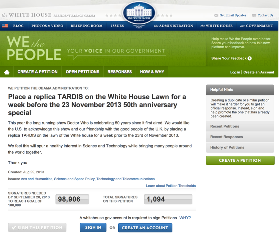
Contrast the design of this signup process with the We The People online petition system. Released by The White House in 2011, this is an interactive web site allowing citizens to petition to The White House’s policy experts.

The release of We The People brought state-of-the-art web site production values, taking advantage of typography, layout, and color, along with a smart interaction design, to make it easy for visitors to sign existing petitions or add a new one. It gives the impression of welcoming citizens to participate in a process of civic engagement.
Both the Global Entry and We The People were designed by teams of government employees. Both teams wanted their constituents to engage successfully with the design. Yet the two designs approach that in a very different way.
The Global Entry sign-up process, though well meaning, is less friendly a process as interacting with We The People. Assuming each had similar resources and constraints, why would the two designs appear to be so different in interaction quality? The answer lies in the team’s intentions and how they rendered them.
A Working Definition for Design
Over the last year, we’ve started explaining design as “the rendering of intent.” The designer imagines an outcome and puts forth activities to make that outcome real.
We’ve found this definition seems to resonate with people more than any other. People can see the relationship between the intended outcome and the process that renders it.
It seems pretty clear to us that the Global Entry team had a typical intention of many government (and non-government) design teams: get the service up and running. A participant only has to sign-up once, then they are in the program. The application process is a necessary, first-step, but once it’s done, the participant will never have to deal with it again. The team’s intention was all about getting something in place.
In contrast, the We The People team wanted to showcase that a government design team can produce designs on par with the best non-government commercial teams. They chose to approach the user’s first interaction with the petition program as an opportunity to highlight how clean, easy-to-use designs play a role in the experience of interacting with the government.
Each team rendered a completely different intention. They each came to a completely different design.
There’s no technical reason why the We The People team had to end up with the design they did. It could’ve been frustrating and hard-to-understand, just like the Global Entry site or many other government web sites. Similarly, there’s no technical reason why the Global Entry site couldn’t have been designed to be easier and better looking. The only reason either team ended up with these sites is because they came to their designs with different intentions.
What Experience Do You Intend?
Once enrolled in Global Entry, travelers find it to be an awesome program. In most of the U.S.’s international airports, the Global Entry traveler only needs to walk up to one of the kiosks, put their fingers on the reader, and check a few boxes on the screen. They can skip the long lines to wait to talk to a Customs Officer, spending no more than a few minutes re-entering the country. It makes arriving from international travel almost as easy as getting off a domestic flight.
(As an added bonus, getting into the Global Entry program automatically qualifies you for the TSA’s PreCheck program. This dramatically improves the airport security experience.)
The experience of signing up on the Global Entry web site is in direct contrast to the experience once you’re using the service. While the web site is cumbersome and bureaucratic, the service is efficient and friendly.
The Global Entry team had great intentions for the overall service. And they’ve rendered it beautifully. Somehow, the web site didn’t get the same treatment.
Experiences are the journeys that people take before, during, and after coming into contact with our design. We can choose our intentions for what we want our users’ journeys to be. And when we render those intentions, we’re designing for our users’ experiences. Experience design is rendering intentions of the user’s journey.
Are You Rendering for the Behaviors You Intend?
A cryptic field label on the Global Entry site will stop the user in their tracks, and often result in a confusing error message. The user’s frustration will mount as they experiment with alternative approaches. Sometimes they’ll discover what the site really wants to know, sometimes they won’t, ending up abandoning the application process.
Was this game of guess-what-we’re-looking-for part of the design team’s intent? Probably not. In cases like these, the team is focused on a different intent: get the underlying database filled with the right data. Little attention is given to how that intention is rendered in the user interface.
What if the team had approached the design with a different intention? What if they had intended that users would get through the sign-up process without ever seeing an error message?
Designer extraordinaire, Robert Fabricant once said, “Behavior is the medium of design.” When we encounter a user’s behavior that isn’t what we’ve intended, we change the design until we see what we want.
The Global Entry team could get a different behavior than the frustration-based data entry confusion they get now. It would take a different design process and a consensus of the entire team that this is worth rendering.
Who Can Render the Intent?
An implication of this definition for design is how it changes our notion of who is a designer.
In any organization, many people share what they’d like to see as the intentions of the design. The business people have intentions with regards to how the business makes money. The technical people have intentions to best use servers, networks, and other technical resources. The legal team has intentions on how to best protect the organization from legal threats.
As these people use their influence to define the outcome of the design, they are, in effect, designing. There’s an old saying, everyone thinks they are a designer. Well, everyone who participates in the rendering of their intention is a designer, using this definition.
The notion of the academically-trained, experienced designer holding the keys to the design outcome fades with this definition. In fact, when we think about design in these terms, it becomes clear that many of the people rendering their intention don’t know they are designers. This implies the role of the experienced designer shifts from owning the design outcome to educating all the other designers on the team on how to best render their own intentions.
Having everyone on the team act as a designer is not, by itself, a bad thing. It brings a lot of power, knowledge, and experience to bear on what are often complex problems to solve. In fact, it can be a great thing when the team has the same intentions.
Does Our Process Get Us What We Intend?
With this definition of design, the process shifts its focus to two distinct activities: Having the team arrive at the same intentions and ensuring we render our intention the way we desire. The teams that produce the best designs are those with the process that separates these activities out.
User research and other design research activities are the core of what we use to make sure our team has a unified set of intentions. We discover what’s happening with our users that we didn’t intend. We look for places where we could do something that would improve the users’ experience. We look at what the competition is doing and ask what we could do that’s even better.
All this research helps us hone in on what our intentions should be. The best teams engage in research like this frequently and often discuss intentions explicitly. They explore different possibilities and arrive at something that everyone agrees matches their overall intention.
Many of our design deliverables, such as wireframes, prototypes, and style guides, are as much about getting agreement on what we intend as they are to move our intentions closer to done. But the deliverables themselves do not produce the designs. It’s having all the people on the team, from the product managers through the developers, sharing the same intention.
We need to look at our design process as a way to come to a single intention as much as it is to make that intention real in the world. And it’s with the lens of this new definition that we can see we still have much work to do before every design will be a great one.
UX Leadership and Influence program
(Formerly called the How to Win Stakeholders & Influence Decisions program.)

Our 16-Week program guides you step-by-step in selling your toughest stakeholders on the value
of UX
research and design.
Win over the hardest of the hard-to-convince stakeholders in your organization. Get teams to
adopt a
user-centered approach. Gain traction by doing your best UX work.
Join us to influence meaningful improvements in your organization’s products and services.
Learn more about our UX Leadership and Influence program today!

