Browse vs. Search in Application Navigation
Originally published on Two Rivers blog on January 18, 2010.
Back in January, I attended a UIE Virtual Seminar called Leveraging Search & Discovery Patterns for Great Online Experiences, with Peter Morville & Mark Burrell. During his talk, Peter mentioned that navigation on web sites has swung back and forth over time between Browse based navigation and Search based navigation. So, for example, ye olden days, if you wanted to buy something at Staples, you were encouraged to browse the site and find what you wanted to buy. Later, search boxes began to pop up all over sites and visitors were encouraged to search more than browse. These days, Peter said, navigation is more of a mix between Search and Browse. I’m still trying to decide if I agree with this, but it got me thinking about related topics near and dear to my heart…
I spend a lot of time designing fairly complicated web applications. Many of these are enterprise level applications—not usually the kind of applications that are visible to the public. These applications are massive data entry, data reporting, and data manipulation applications. And they often have hundreds or even thousands of screens. As you can imagine, we spend a lot of time designing the navigation systems for these applications.
Nearly all of these navigation systems are Browse based. That is, if you want to find the screen for “Convert Prospect to Customer” you go to the menubar (if it’s a desktop application) or to the tabs, menus, tabbed menus, left side navigation, etc. (if it’s a web based application). You might look for a Level 1 item called “People”, then a Level 2 item called “Prospects” and then a Level 3 item called “Convert Prospect to Customer”. In this example you are browsing through a list of hundreds of screens that have been grouped together in different ways to find the screen you need. (NOTE: This is different from browsing a list of products for sale, or customers at a company—those are data. We’ve seen lots of examples of Searching and Browsing for data navigation. I am interested in application navigation.)
After I heard Peter talk I asked myself: IS there an example of Searching in application navigation? And I remembered: Apple uses it on the Help menu of every application on their desktop platform.

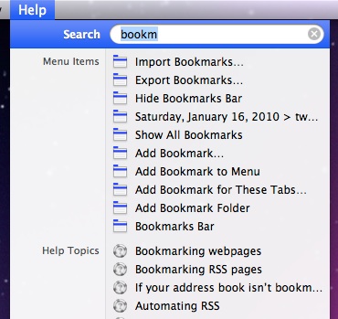
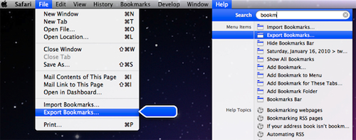
In this example, I’ve opened the Help menu in Safari and typed “bookm”. The first group of items I see is Menu Items that contain that text. Then there’s a list of Help Topics on the same. If I move the mouse down to highlight “Export Bookmarks,” then it actually shows me where the menu item can be found by opening the menu, highlighting the command, and putting a little moving arrow next to it.

I actually use this a lot in more complicated applications and it works really well IF I know the name of the command I’m looking for. If I had searched for “Favorites,” I wouldn’t have seen anything. Similarly, if I had misspelled it as “Bokmarks” I would have been out of luck. There’s no stemming, synonyms, or anything fancy about this search—if you want something beyond what’s actually in the menu, you’re out of luck (actually, that’s where the Help Topics pick up—they catch a lot of those items in there).
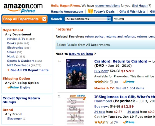
Then I remembered that a year or two ago I was trying to find Amazon’s return policy. I went to their search box and typed “Returns”. At this point I wasn’t trying to navigate their data (all the stuff that’s for sale), but rather their applications (find me screens about returns). The search results were, as you might expect, entirely focused on data:

I can see by the “Related Searches” that I’m not the only person doing this. I see “return policy” “returns and refunds”, and “returns center” are all Related Searches. Looking at that again, now, I see that they have a little link that says “Need to Return an Item”. So they have application navigation searching too (it’s a little to subtle for me).
When I gave my own UIE Virtual Seminar last year on Navigation, I got a question from one of the attendees. He said that it was a requirement at his company that the user be able to get to any screen in the product (and there were 1,000+) with no more than 2 clicks. Let me say that I think this is a pretty bogus requirement and probably has no basis whatsoever in actual usability of the product… But that aside, I enjoyed the challenge of thinking about how I’d do it. At the time, I was imagining a massive Site Map of the application, but now I think that perhaps another way to satisfy that requirement would be to implement the kind of searching that Apple has.
UX Leadership and Influence program
(Formerly called the How to Win Stakeholders & Influence Decisions program.)

Our 16-Week program guides you step-by-step in selling your toughest stakeholders on the value
of UX
research and design.
Win over the hardest of the hard-to-convince stakeholders in your organization. Get teams to
adopt a
user-centered approach. Gain traction by doing your best UX work.
Join us to influence meaningful improvements in your organization’s products and services.
Learn more about our UX Leadership and Influence program today!

