Breaking Up Large Documents for the Web – Part 3
This article is an excerpt from Ginny’s book Letting Go of the Words: Writing Web Content that Works.
Editor’s note: This is part 3 of a 3 part series. You can access part 1 and part 2 to read.
PDF—Yes or No?
You probably already know this, but just in case… PDF stands for portable document format. PDF was invented by Adobe Systems, Inc. (www.adobe.com), as a way to publish documents that anyone can read, regardless of whether they are working in the same operating system or using the same software that the document’s creator worked in.
A PDF file keeps the layout, page breaks, and fonts of the original document. With PDF, you can have a document that looks the same whether you send a paper copy to someone or that person prints it from the web.
Anyone who has Adobe Acrobat Reader on a computer can open, read, and print the document. Most new computers today come with Acrobat Reader already installed, and Adobe allows free downloads of Acrobat Reader from its web site. Anyone who is comfortable downloading and installing software can have a copy.
Should You Rely on PDF Files for Your Web Content?
I’m not going to say, “Never put up a PDF file.” As always, it comes down to your goals, your audiences, and their scenarios.
However, realize that, with most PDF files, you are providing a paper document on the web rather than web-based information. If the document looks like a paper document or if it is large, people are likely to print it rather than read it on the screen. You have distributed the document; you have saved the printing and shipping cost; you have shifted the cost and effort of printing to your audiences—but have you really met their needs?
When Might a PDF File Be Appropriate?
If you are using the web to distribute journal articles or other material that you expect people to print and use on paper, and if your audiences are comfortable with PDF files, PDF may be the right way to go.
The web is a great distribution mechanism:
- Many people are now more comfortable going to a search engine than trudging down to the library.
- You can get the PDF whenever you want (no need to know when the library is open; no need to work only in the daytime).
- A search engine may find what you want from a few keywords (no need to understand the way the library organizes the journals; no need to go hunting through the stacks; no worries that someone else will have already taken the article).
- You can send the link to colleagues or get the document instantly because someone sent the link to you.
- You can have and give access to the documents to people who might not live near a library or who are in countries where mail delivery is slow or unreliable.
Distribution is the great advantage that the Internet has over paper, even for paper documents.
When Is a PDF File Not Appropriate?
However, PDF documents are often not the best way to create a useful and usable web site. Break documents into non-PDF pieces—
- when people don’t want the whole document
- when people want to read from the screen
- when your audiences are not comfortable with PDF files or with downloading software
- when accessibility is an issue—and you should always consider accessibility
When People Don’t Want the Whole Document
If people come to your web site for information—not for documents as a whole, but for only some of the information in those documents—a PDF file defeats the very purpose and nature of the web.
Yes, PDF files are searchable. But people don’t want to first navigate or search to get the document and then search again within the document. They want to navigate or search directly to the specific information that they want. And many people don’t know how to search in a PDF document.
And yes, you can divide up a PDF document and give it a linked table of contents so that people who know how to open the index list can jump to a specific place in the document—but only if you have set it up well. Most PDF files are just put up on the web, with no attention to internal links.
A story: I was getting information from the web site of a government agency when I reached a point where I needed the physical address of one of the agency’s regional offices. A link on the page said it would take me to a list of the regional offices. What would you have expected to happen by clicking that link? I expected a single page with a list of offices. To my surprise, Acrobat started to open. I waited, as one must, and a document opened that had nothing at all to do with regional offices. It was a report on something totally different from the topic I was getting information about. My first thought was “wrong link,” but curiosity led me to at least look quickly through the document. Sure enough, an appendix 20 pages later was the list of regional offices I needed.
That’s not a good use of PDF. If the link promises a list of offices, take the page out of the paper document and make it a separate (not PDF) web page.
When People Want to Read from the Screen
Why make the document look just like paper if it is not meant to be used on paper?
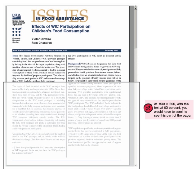
For example, a two-column layout works very well on paper. It doesn’t work well on the web if you can’t see the entire page without scrolling. On the screen, people have to scroll down while reading only halfway across the screen and then scroll up again to read the second column.
A document like the U. S. Department of Agriculture Issue Brief in Figure 5-14 just begs to be printed and read off-line.

When Your Audiences Are Not Comfortable with PDF Files or with Downloading Software
If you have a public audience, don’t assume that a PDF file is acceptable. Not everyone has Acrobat Reader. Not everyone is willing or able to download and install software even if it is free. In usability testing that I did in 2004 on information about cancer, more than half of the public participants-cancer patients and their family members-were unwilling to select the PDF option. They said they saw the PDF symbol all the time, but they didn’t know what it was and never chose it. They had never downloaded programs onto their computers, and they were leery of doing so.
Even people who have computers that come with Acrobat Reader may be uncomfortable going to PDF files. For people with dial-up access or slow machines, a PDF file may take a long time to open.
PDF files often open in a second window, and second windows cause problems for many people. They want to back out of the file that came up, but Back isn’t available—and they don’t realize that they now have two browser windows open.
When Accessibility Is an Issue
For many years, PDF files did not work well for people who use assistive software, such as screen-readers. That has changed. Adobe Acrobat 8.0 supports tagging so that accessibility software can read a PDF file.
But…
- For Acrobat to work well with a screen-reader, the author has to set up the file well with correctly marked headings, appropriate tags for images, and other elements that the screen-readers need. Most PDFs aren’t well set up.
- If you scan a document as a graphic file to get it on the web, even Acrobat 8.0 can’t tell what to do with it to make it accessible.
- Many people who use assistive software still bypass PDF files. Experience has taught them that PDF files are not accessible. Even though PDF files can now be made accessible, so few are that people have no reason to change their negative expectations.
- Many people (not only those who use screen-readers) do not update software regularly, even if it is free. It takes time and effort to upgrade. People may be afraid that the upgrade will not work well with something else on their machine. They may not want to take the time to learn new features. They may need authorization from a supervisor or another group in the company to upgrade.
PDF Files Are Optimized for the Printed Page
A typical PDF page is in portrait orientation. Most web users are looking at landscape-oriented screens.
Acrobat Reader Works Differently from Browsers
Users have to learn yet another way of navigating, another way of printing, another way of searching.
As a web content specialist or a web developer, you may be comfortable going back and forth among different browsers, even though that means changing where and what you click on. Are the people you are writing to all equally comfortable doing that?
PDF Files Are Usually Paper Documents-Not Written in Web Style
If the author was in “paper mode”-in “document mode” or “book mode”-when writing what becomes the PDF file, it’s very likely that the writing isn’t going to work well on the web. The paragraphs will be too long. The headings will be too sparse. The author will have probably assumed that people coming to the document will read it from first page to last.
In Some Cases, Offer Both Versions
If some site visitors want information on the screen and others want entire documents, offer both. Many sites do.
When you link to a PDF, tell people that’s what they are getting and how large it is or how long it will take to download.
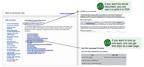
Figure 5-15 shows you how employees at the U. S. Federal Aviation Administration can choose to download a PDF of their entire web content standards or get an HTML page on specific topics in the standards.

Summarizing Breaking Up Large Documents for the Web
Here are key messages from Chapter 5:
- Break up large documents.
- Think “topics,” not “book.”
- Divide web content by:
- time or sequence
- task
- people
- type of information
- questions people ask
- Decide how much to put on one web page by considering:
- how much people want in one visit
- how connected the information is
- how long the web page is
- the download time
- whether people will want to print
- how much they will want to print
- Think carefully about using PDF files for your web content.
- PDF is more of a distribution mechanism for paper documents than a good way of giving web content.
- PDFs are appropriate in some situations.
- But consider not using PDFs when
- people do not want the whole document
- people want to read from the screen
- your web users are not comfortable with PDF files or with downloading software
- accessibility is an issue
- In some cases, the best solution is to offer both PDF and HTML versions of your web information.
UX Leadership and Influence program
(Formerly called the How to Win Stakeholders & Influence Decisions program.)

Our 16-Week program guides you step-by-step in selling your toughest stakeholders on the value
of UX
research and design.
Win over the hardest of the hard-to-convince stakeholders in your organization. Get teams to
adopt a
user-centered approach. Gain traction by doing your best UX work.
Join us to influence meaningful improvements in your organization’s products and services.
Learn more about our UX Leadership and Influence program today!

