
The Apple Store’s Checkout Form Redesign – Part 2

Originally published on LukeW Ideation & Design on December 16, 2009.
Read part 1 of this 2 part series.
Automatic City & State Input
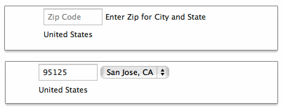
On the new Apple checkout form, people are asked for their ZIP code first and then given a set of choices for their city and state. On the plus side, this interaction design removes some awkward ways of answering questions. Specifically: drop-down menus for states that run 50 entries high. On the negative side, when faced with a set of inputs that match the structure of a mailing address (as mentioned above), people often skip over labels as they fill in the pieces. The components and layout of an address are familiar to just about everyone in the US. The Apple site breaks this structure by asking for ZIP code out of order.
Dynamic Indication
Any question you ask people in a Web form requires them to parse it, formulate a response, and then input their answer in the affordance you have provided on the form. Being vigilant about every question you ask allows you to remove questions that are not absolutely necessary, or can be asked at a better time or place, or can be inferred automatically. And the fewer questions you ask, the better the odds are of people completing your forms quickly and easily.
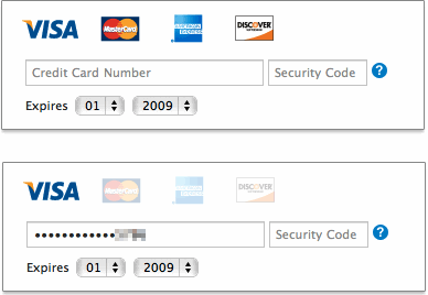
Credit card numbers follow a consistent structure. American Express cards start with either 34 or 37. Mastercard numbers begin with 51-55. Visa cards start with 4. And so on. This information can be used to infer what type of credit card someone is using simply by looking at his credit card number.
In their redesigned checkout form, Apple does exactly that. When someone enters a credit card number, the appropriate card type is highlighted directly above. This eliminates the need to ask people what type of credit card they have—one less question to parse, think through, and respond to.
Selection Dependent Inputs
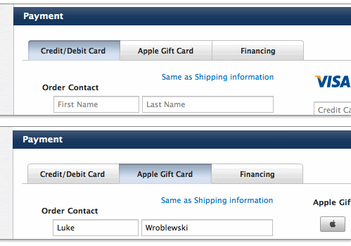
Selection dependent inputs require people to answer follow-up questions based on their answer to an initial question—usually without having to go to another Web page. The new Apple checkout form’s payment section uses selection dependent inputs to ask follow-up questions based on the payment method people select. Horizontal tabs arranged across the top of the Payment section allow people to navigate to a section of the form that contains appropriate selection-dependent inputs. The tabs present not only the initial set of options, but also provide a strong indicator of the current selection.
While most people are familiar with the concept of navigation tabs on the Web, the way in which they fill in Web forms may impair the effectiveness of this approach. When completing a form, many people move from top to bottom and, as a result, may ignore horizontal options. There may also be a lack of clarity about whether horizontal tabs are mutually exclusive. Will I submit my selections on all three tabs with the form or only the selections I made on the active tab?
However, when testing horizontal tabs in Web forms for my book Web Form Design, none of our participants made any errors, they were able to complete the task quite quickly, and provided high satisfaction scores for this design. So Apple seems to have picked the best fitting UI for this task from the options available.
Primary Action
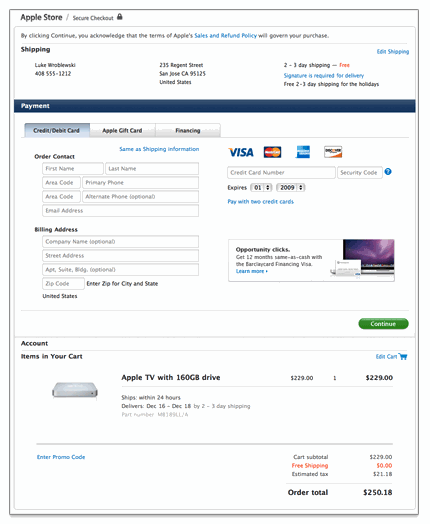
As we saw, Apple’s previous checkout form had a number of visual calls to action of varying shapes and colors. The new design significantly reduces the visual weight of secondary actions and puts all the focus on one primary action: Continue. This helps to illuminate a clear path to completion in the form.
Error Messaging
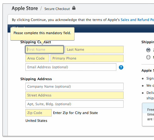
Apple’s new checkout form also introduced in-context error messages. So errors are now displayed next to the input fields causing them with clear instructions on how they can be resolved.
Another Error Message
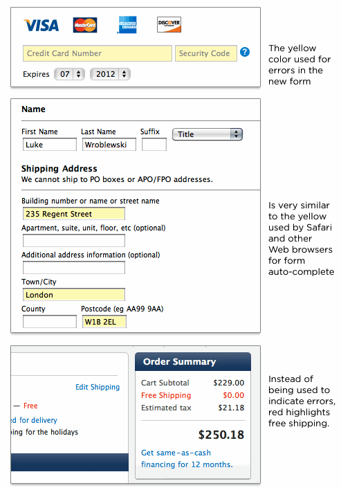
However, the elimination of a top-level error message means it is possible to enter a state where errors are present on a page but only indicated through a light yellow background color. I had this issue come up when changing my credit card information. The credit card number and security code were in an error state but nothing on the form (beyond the light yellow color) told me that. This is especially troubling when you consider that Apple’s Web browser, Safari, and other browsers use a similar shade of yellow to indicate input fields they autofill for you.
In fact, in Apple’s previous checkout form a light yellow background indicated an auto-completed input field. In the new checkout form, it indicates an error. Why isn’t Apple using red (the standard color for errors) in its form? That seems to be reserved for free shipping!
UX Leadership and Influence program
(Formerly called the How to Win Stakeholders & Influence Decisions program.)

Our 16-Week program guides you step-by-step in selling your toughest stakeholders on the value
of UX
research and design.
Win over the hardest of the hard-to-convince stakeholders in your organization. Get teams to
adopt a
user-centered approach. Gain traction by doing your best UX work.
Join us to influence meaningful improvements in your organization’s products and services.
Learn more about our UX Leadership and Influence program today!