
The Apple Store’s Checkout Form Redesign – Part 1

Originally published on LukeW Ideation & Design on December 16, 2009.
Though most people wouldn’t consider Apple’s Web site an important online destination, November saw Apple in the top ten list of US Web sites. 62 million Internet users visited Apple online during the month with an average of 1 hour and 18 minutes spent per user. By comparison, Google had 155 million unique visitors in November.
Apple’s online store certainly played a role in this achievement as retail sales data shows that Mac sales were up 21% year-over-year in the months of October and November. So it’s interesting to note that Apple’s primary online sales channel (Web-based checkout) was redesigned during this time.
Apple’s Previous Check Out Form
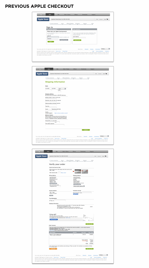
The previous design of Apple’s checkout form spanned multiple pages and utilized a top-level progress indicator to highlight where people were in the process. Errors were displayed at the page-level and did not reference the fields responsible for errors nor provide actionable remedies when error messages showed up. The final checkout confirmation screen had a confusing mix of buttons instead of a single primary call to action.
In our research, many customers found this addition to be a nice benefit, stating that they could imagine using it at some point. However, many of those customers were frustrated by the feature’s design.
Checkout Progress Indicator
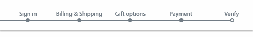
While it’s certainly a good idea to let people know how far along in a process they are, you need to be wary of progress indicators that incorrectly represent the number of Web pages or steps required to complete a form. An all too common practice for forms spanning multiple Web pages is the inclusion of a progress indicator that does not accurately mirror the number of pages a form requires.
Consider a typical ecommerce checkout form progress indicator that states there are three pages of inputs you can expect: shipping, billing, and place order. When it comes time to select a shipping address, however, page one is selecting from an existing list of shipping addresses. If the address you want to ship to is not listed, an additional page is required, and you need to add a new address. All of a sudden, step one becomes two steps. When selecting billing in step two, you may need to verify an online payment service provider, log in to its site, select a source of funding, or provide a new billing address. Now step two is four steps.
So we’ve taken six steps to accomplish what we told our customers was going to take two steps. It’s not that giving people a sense of how many steps are required is a bad thing; but we are rarely telling them the truth. One solution is to avoid the progress indicator altogether and just get people through the form as fast as possible. The other is to provide a more high-level progress indicator that does not set expectations explicitly.
Error Message
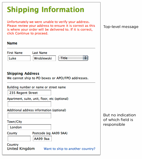
The input field that is responsible for an error should not only be visible on the page but also prominently marked. Both the top-level error message and this input field need to have clear instructions that encourage people to either try another answer or seek help if they can’t. The inclusion of instructions next to the input field responsible for the error provides people with a remedy where they need it most: where the error can be fixed.
Primary Action
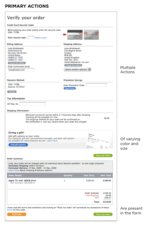
Actions such as Submit, Save, or Continue are intended to enable completion, which is the primary goal of just about anyone who has started filling in a form. Because they enable the most important action on the form (completion), they can be referred to as primary actions. Secondary actions, on the other hand, tend to be less utilized and often allow people to retract the data they’ve entered. Because secondary actions can have negative consequences, especially when used unintentionally, I’ve often argued they should be absent from forms.
That said, there are situations where secondary actions make sense (such as Save for Later, Preview, Export, etc.). Though it may be tempting to treat Previous and Next as equal actions in these circumstances, keeping people moving forward with a primary Continue action and a secondary Back action is likely to be more productive. After all, we want people to complete these forms, right? When you reduce the visual prominence of secondary actions, it minimizes the risk for potential errors and further directs people toward a successful outcome.
New Apple Checkout Form
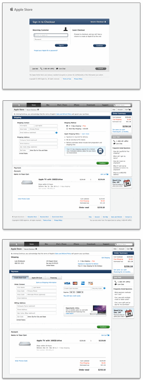
Apple’s redesigned checkout form utilizes an accordion interaction to move people through sets of related questions. This eliminates the need for multiple Web pages and the progress indicator in the previous design. As people complete each section, the form expands inline to display the next set of required questions. You can see this in action on the Apple store.
Accordion Interaction
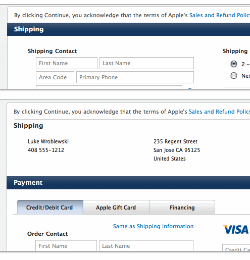
While the previous form design used top-aligned labels to present questions to users, the new design utilizes top-aligned labels for section headers only and labels within input fields for everything else. In cases where available screen real estate is scant (like an accordion form), combining labels and input fields into a single user interface element may be a tempting way to conserve precious space. However, there are a number of considerations worth calling out.
Labels Inside Input Fields
A reliable interaction for labels within forms requires the label to disappear quickly when people place their cursor into the input field so they can easily provide their answer. Otherwise, the label might stay and become part of someone’s answer.
Because labels within fields need to go away when people are entering their answer into an input field, the context for the answer is gone. So if you suddenly forget what question you’re answering, tough luck—the label is nowhere to be found. As such, labels within inputs aren’t a good solution for long or even medium-length forms. When you’re done filling in the form, all the labels are gone! That makes it a bit hard to go back and check your answers.
Apple’s solution may be able to mitigate this issue because the form is mostly asking for inputs with a known structure. Mailing addresses, for example, have a widely known structure that can be leveraged to help people understand how to answer questions about shipping or billing locations. Other examples include first name and last name, date and time, or the parts of a phone number. These input groups can be utilized within forms to provide additional clues on which questions were answered (once the labels are gone). The always visible section headers help as well.
Lastly, labels within input fields should be presented in a way that makes it obvious at first glance that they are labels and not answers. The Apple form grays out the label text to distinguish labels from answers.
Read part 2 of Luke’s article.
UX Leadership and Influence program
(Formerly called the How to Win Stakeholders & Influence Decisions program.)

Our 16-Week program guides you step-by-step in selling your toughest stakeholders on the value
of UX
research and design.
Win over the hardest of the hard-to-convince stakeholders in your organization. Get teams to
adopt a
user-centered approach. Gain traction by doing your best UX work.
Join us to influence meaningful improvements in your organization’s products and services.
Learn more about our UX Leadership and Influence program today!