Classification Schemes—and When to Use Them
Originally published on UX Booth’s web site on April 27, 2010.
When you do information architecture work, you’ll realize that most sets of content can be organized in more than one way. One of the challenges for an IA project is figuring out what way works best for your audience, your content, and your project’s goals.
In this article, I’ll talk about a few different classification schemes you can use to organize your content and offer tips on when and how to use each.
Alphabetic
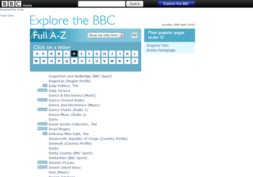
Alphabetic schemes can be used for practically any type of information—as long as you can give an item a name, you can include it in an A-Z scheme. But that doesn’t mean alphabetic schemes are necessarily good for all content. Alphabetic schemes work best when people know what they’re looking for, know how to describe it, and the item labeling matches the words that they’re looking for. An alphabetic scheme is perfect for this type of task as people can simply scan a list of words and spot the one they’re looking for.
There are only a couple of situations where you’d use alphabetic as the main way of organizing your content—dictionaries and glossaries come to mind. But they’re great secondary schemes to a main scheme. Even as a secondary scheme they can be valuable; I’ve worked on intranets where people said: “Do whatever you like, just don’t take away the A-Z.”
When people ask me about using A-Z indexes, three questions always come up. I’m not a professional indexer (indexing is an entire profession in itself) so my answers just skim the surface:
-
Should I list things twice?
Yes. List things under two headings where there are two common terms for something, and where you know people will use more than one term. Be conservative though—you don’t want to double the size of your index by adding extra terms. Do it only when there is a real need.
-
Should I use more terms that are technically correct, or the words people use?
You’ll often find that people use inaccurate, outdated, or incorrect terminology. If this happens, and you know they will use these terms, add them to the A-Z index. If you’d like to educate them about correct terminology, include it alongside the more common one.
-
Should I list every content page?
When using an A-Z index, you usually don’t need to include every content page. You probably will want to include all of your main topical pages or landing pages, though this will depend on your site structure and type of content. For example, on an intranet you may have an index item for ‘maternity leave’ but probably not for the individual pages on maternity leave.
User research is a great input into an A-Z as you should have a rich resource of the terminology people use.

Geography
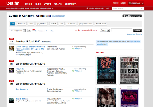
Geographical schemes can be used for any content with some sort of geography as a key attribute. I can’t tell you how many web and intranet project meetings I’ve been in where someone has said: “We should just include a map on the home page and let people use that.” In some cases it’s a perfectly good suggestion, but in others, it’s not so good.
So when is it good? There are two real criteria for a successful geographical scheme. The first is that your audience must want to access information in that way. The second is more important—they must understand the geography you’re using, often in quite a lot of detail.
One thing to consider when using a geographic scheme is the difference between using a map to display information and using a map to navigate to it. Two different uses for maps can mean quite different things for users. Think about what you’re trying to achieve with a geographical scheme/map. Are you trying to show precisely where various objects are in the world? Or are you trying to help people get to content about a particular area? By figuring this out, the map’s purpose will be clearer; a map for navigation doesn’t need to be particularly accurate, but a map for displaying information certainly does.
Geography may be good as a secondary way to access information, supporting one of the other schemes.

Format
A format schema organizes content around the format of the file. This is particularly common on sites such as instructional websites (where they group videos, articles and tutorials) and article websites (where they group articles, interviews and tools).
Again, it’s a fine way of organizing your content as long as your audience expects and wants to find it like that. I must admit I have my reservations. I think people think first about what they want to do, and then about the format they want to see it in. If I want to find out how to do a better shoulder stand (a yoga position), I’ll want to find out about shoulder stands first before deciding whether to read instructions, watch a video or hear a description. I certainly don’t want to look in three different parts of a site to see what’s available.
Format is a great way to show people the different types of information available once they’ve found the topic.

Organizational Structure
Another scheme you’ll come across in both intranet and website work is the structure of the organization you’re working with. This scheme comes about because it’s easy for authors; they can prepare information and put it in ‘their’ part of the site. And managers can see not only where their stuff is, but also the stuff for their section.
The biggest problem with this structure is anyone who needs the information needs to know who is responsible for it. Generally, this is a bad way of organizing information. Of all the projects I’ve worked on, I’ve suggested the organization structure be retained only twice (and both were for intranets):
- In a very small organization where everyone does know who does what. This was supported via user research.
- In an organization where structure and rank matter a lot. In my situation, this was a Defense Department. I saw little point trying to remove the organizational structure from the intranet as the internal structure was so much a part of how they thought. It didn’t mean that staff knew who did what though, so we provided other ways for them to find information.
Task
Task-based schemes are interesting. On the surface they seem to be fairly easy—just organize the content around the main tasks that people do. But whenever I’ve tried doing this (usually because a client thinks it’s a good way to start) we end up with so many and varied tasks that it becomes too difficult. Even if we come up with a draft, we often find that most of the time a particular piece of content will apply to more than one task.
I’ve found that task-based schemes work best when:
- There are only a small set of tasks
- The main tasks have quite clear boundaries
- Your content is easy to allocate to the task groups
Task-based classification schemes tend to be more suited to things like web applications more than websites and intranets. However, even something like accounting software (which is quite a task-based activity) doesn’t fit into tasks, but instead to the content types you’ll work on.
When you’re looking for tasks in your user research, keep an eye out for phrases like “I need to” or “I do”. Whatever follows is usually a task.

Audience
Audience schemes are very much like task-based schemes, in that they often sound like a good approach on the surface but are harder than they look.
Audience schemes are suitable, and only work when:
- You can split your audience into groups, with very clear boundaries
- At any point in time, a user can identify which group they belong to (they may switch groups for different tasks—this is okay as long as they know where they fit each time)
- Your content assigns across audience groups without too much overlap
Again, this is much harder than it seems. In most cases when we start along this path, it’s hard enough identifying the audiences in the first place—people cross over groups and aren’t sure who they are, and a lot of content applies to more than one group. If you have this problem, try a subject-based scheme as your primary scheme and use an audience scheme as a secondary way to help people find specific information.

If you decide an audience scheme is best for your content:
- Make sure the boundaries are clear. For example, don’t use small, medium and large; use numbers to describe what they are about.
- Label the groups in the same way that your users will talk about them.
Something to keep in mind when creating audience schemes: you can potentially limit access to information by audience, or at least make it hard for them to find a full range of information. If your audience groups are sensitive, or it looks like you’re restricting access by audience, make sure this is what you intended.
Subject/Topic
The type of classification scheme you’ll use most often is a subject scheme (or topic scheme—I use the terms interchangeably). And chances are you’ll be coming up with it from scratch. A subject scheme groups similar things together based on what they’re about.
It’s worth knowing this type of classification scheme works well for most content. (I’m yet to meet a set of content I couldn’t arrange topically). And as long as you can do it in a way that makes sense for your audience, it will be suitable for them as well.
Combination Schemes
I’ve described these classification schemes as if they are all independent. In reality you can use a combination; you could:
- Mix up types at each level
- Start with one type and use a different type at the next level
- use more than one approach for your whole content set
In sum, there are no hard and fast rules. The main things, as I’ve said, are that it works well for your audience, they expect to access information in this way, and it works well for your content.
UX Leadership and Influence program
(Formerly called the How to Win Stakeholders & Influence Decisions program.)

Our 16-Week program guides you step-by-step in selling your toughest stakeholders on the value
of UX
research and design.
Win over the hardest of the hard-to-convince stakeholders in your organization. Get teams to
adopt a
user-centered approach. Gain traction by doing your best UX work.
Join us to influence meaningful improvements in your organization’s products and services.
Learn more about our UX Leadership and Influence program today!

