Net Promoter Score Considered Harmful (and What UX Professionals Can Do About It)
In 2003, a marketing consultant named Fred Reichheld lit the business world on fire with the Harvard Business Review article The One Number You Need To Grow. He asserted that by asking a single question—a question aimed at determining the organization’s customer’s loyalty—management could take the pulse of their customers’ feelings towards their business. He ended the article with “This number is the one number you need to grow. It’s that simple and that profound.”
It turns out, it’s neither simple nor profound. It doesn’t help businesses grow. It doesn’t even tell the management how loyal the customer is.
Yet, Net Promoter Score (also known as NPS) meets all the common requirements of a “useful” business metric:
- It’s easy to measure.
- It produces a number you can track.
- It feels legitimate.
Even though NPS has been solidly debunked in many smart research papers, it’s still solidly embedded into many businesses. We hear about companies rolling out new NPS measurement programs every day.
Industry leaders continue to sing NPS’s praises. For example, Stephen Bennett when he was CEO of Intuit: “Every business line now addresses [NPS] as part of their strategic plan; it’s a component of every operating budget; it’s part of every executive’s bonus. We talk about progress on Net Promoter at every monthly operating review.”
Companies like Intuit base their critical decisions on this metric, but the metric isn’t measuring what they think it is. In fact, NPS measures nothing in particular. Let’s unpack how it works to see just how vacuous NPS truly is.
The wacky science behind the NPS formula
One of the crazier things about the Net Promoter Score is how it’s calculated. The inputs come from a simple survey. Respondents are asked a single question: How likely are you to recommend [COMPANY] to a friend or colleague? On an eleven-point scale, with zero marked as Not At All Likely and 10 marked as Extremely Likely, respondents pick a number. (In later versions of the survey, Fred Reichheld suggested people ask a subsequent question about why they gave it that score. We’ll address that second question in a moment.)
Any normal statistician would just report on the mean of all the scores they collected from respondents. For reasons never fully explained, NPS doesn’t like the mean average of the numbers they receive. Instead, they segment the scores into three components:
Any 9s or 10s are considered Promoters.
Any 7s or 8s are considered Passive respondents.
And any score from 6 to 0 is considered a Detractor.
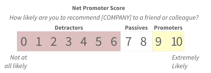
The formula to calculate the score is:
Net Promoter Score = % of Promoter respondents minus % of Detractor respondents
Let’s say we have 10 respondents’ scores. The data is 0, 0, 1, 4, 5, 6, 7, 8, 9, and 10.
The average of these 10 numbers is a 5.
We would calculate the Net Promoter Score as 20% minus 60% or -40.
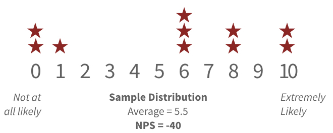
An average of 5 doesn’t sound good or bad. It’s neutral. However, -40 sounds awful. (Not as awful as -100, but still pretty bad.)
That’s because the thinking behind NPS is that someone who gives a neutral score isn’t going to say the good things about a company that a promoter would. They won’t be loyal. We need to convert them to promoters. So we consider them a detractor.
NPS hides UX success
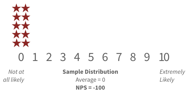
Let’s say we’re having a bad day and 10 respondents give us all zeroes: 0, 0, 0, 0, 0, 0, 0, 0, 0, and 0.
The average of these ten numbers is a 0. (Makes sense.)
NPS is -100. That’s the worst it can get.
That makes sense. Zeroes are yucky scores. Let’s not reward yucky scores.
Now, let’s say the team works really hard. They make the product so much better.
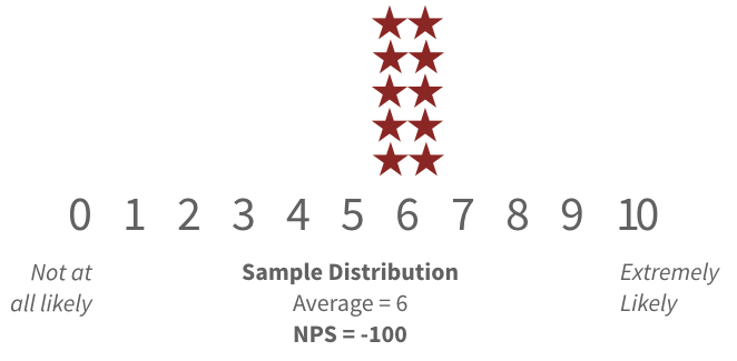
After all this hard work, we get all sixes: 6, 6, 6, 6, 6, 6, 6, 6, 6, and 6.
The average of these ten numbers is 6.
But NPS is still -100.
For some reason, NPS thinks that a 6 should be equal to a 0. Nobody else thinks this. Remember, if you worked at a company like Intuit, all that hard work to get everyone to move from a 0 to a 6 would not be rewarded. Your executive would not get their bonus. It’s as if you didn’t do anything.
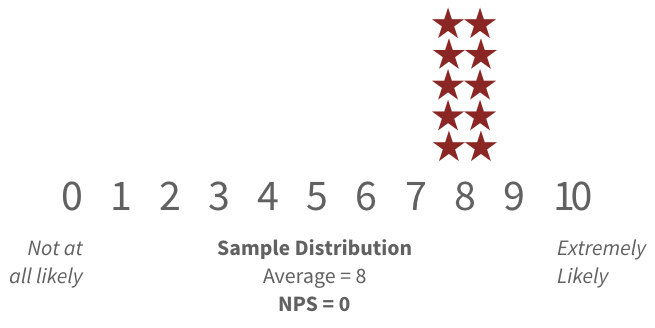
Of course, that’s because you got everyone to select a six. What if you made the product better enough for each to put respond with an eight? 8, 8, 8, 8, 8, 8, 8, 8, 8, and 8.
The average is 8. Yet, NPS is now… 0.
Moving all of your users from zeroes to eights would be quite an achievement in any normal organization. But, if your organization isn’t impressed with an NPS outcome of zero, no bonuses for you.
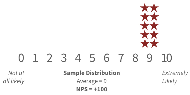
Make that data set to be all nines: 9, 9, 9, 9, 9, 9, 9, 9, 9, and 9.
The average is 9. And miraculously, NPS is 100!
That’s 100% improvement over 8, so woohoo! You get your bonus, finally. By nudging that data just a little, you changed the NPS score from the middle of the scale to the highest possible score. Aren’t you a genius?
As you can see, the NPS calculation makes little sense. There is no business or mathematical reason for these awkward, abrupt changes in the score.
Small incremental improvements should result in small incremental score increases. Only large improvements should result in large score changes. Yet, for reasons nobody can explain, NPS doesn’t work that way.
This is what Kate Rutter calls Analytics Theatre. Creating dramatic swings in numbers for the sake of drama, but not because they help us make our products or services better.
An average gives a far better view into what’s happening with the numbers. It’s just as simple and reveals important improvements.
If the only problem with NPS was how we calculated it, then we could just switch to using an average. Yet, averages only work when the data makes sense. Unfortunately, the way respondents interpret the NPS question creates a data set that doesn’t make sense.
An eleven-point scale pretends noise is science
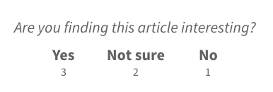
What would you answer if I were to ask you a question like Are you finding this article interesting? and gave you the choices Yes, No, and Not sure. One of those three answers would likely be easy to pick.

That’s a 3-point scale. If I upgrade it to a 5-point scale, you might find it harder to answer: Very Interesting, Mildly Interesting, Not Sure, Mildly Not Interesting, Very Not Interesting. After all, what does ‘mildly not interested’ mean? Does it mean you’re a little interested but not enough interested to keep reading?

A 7-point scale makes this even more difficult. When we run out of labels, we resort to numbers: Very Interesting, 6, 5, Not Sure, 3, 2, Very Not Interesting.
Not only is this hard to answer, it’s hard to interpret. What is the difference between a 3 and 2? Both are on the negative scale, but do they mean different things? Are respondents capable of being consistent, not just across different times they each answer the question, but with other respondents?

NPS uses an 11-point scale. That’s a large scale with a lot of numbers where the distinction isn’t clear. You and I could have the exact same experience, yet I’d give it a 7 and you’d give it a 6. Is there a meaningful difference?
We’re somehow supposed to understand the difference between a 6 and a 7. But many respondents don’t. It’s their whim as to what they choose.
In NPS, a dataset full only of sixes scores -100 and a dataset full only of sevens scores 0. To NPS, it’s a very big distinction, but to a respondent, it’s just noise. Respondents can’t tell you why they’d pick one over the other.
The NPS question: garbage in, garbage out
When implementing NPS, we ask each respondent How likely are you to recommend [COMPANY] to a friend or colleague? On the surface, this question seems to be about customer loyalty. In the original HBR article, the author claimed it correlated strongly with repeat purchases and referrals.
Later studies show it doesn’t. Here’s why not:
The best research questions are about past behavior, not future behavior. Asking a study participant Will you try to live a healthy lifestyle? or Are you going to give up sugar? or Will you purchase this product? requires they predict their future behavior. We are more interested in what they’ve done than what they’ll do. We’re interested in actual behavior, not a prediction of behavior.
Here’s an example. Thanks to Dan Barker, a UK analytics consultant and NPS enthusiast, we now have a 16-month snippet of NPS data from a single e-commerce customer.
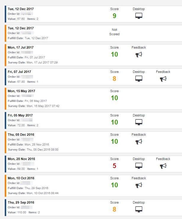
As you can see, Dan’s 9 NPS data points vary, from 5 up to 10. What this data doesn’t tell us is whether the respondent ever did what the question asked. We don’t know if they recommended the company to a friend or colleague.
We see from Dan’s purchase data, his shopper spent the most money ($110) as they responded with an 8. They rated their lowest amount spent ($57.60) with a 9. The order value when they scored a 5 was only $3.00 less than only order they rated a 10. From this data, we see there’s no correlation between shopping behavior and NPS response. Nor is there any evidence of loyalty.
Is NPS really about loyalty and growth?
Loyalty is a long play. It’s about how someone behaves over a long period of time. In his original HBR article, Fred Reichheld said “Loyalty is the willingness of someone—a customer, an employee, a friend—to make an investment or personal sacrifice in order to strengthen a relationship.”
Yet, the NPS question doesn’t talk about investment or personal sacrifice. It doesn’t even talk about loyalty. It only asks about recommending the company.
Asking someone about what they’ll do in the future isn’t about loyalty. It’s about optimism.
If we were truly interested in understanding someone’s loyalty, we could ask a different question: In the last 6 weeks, have you referred us to a friend or colleague? This, in fact, is the exact question Netflix asked its customers during its early years. Netflix paired it with another critical question. They asked all new subscribers Were you referred to us by a friend or colleague?
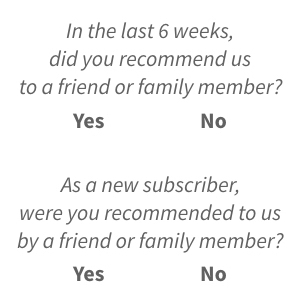
Netflix saw a steady increase in new subscribers and growth when people said yes to these questions. And when people stopped saying yes, they saw an cancellations increase and new subscriber acquisition slow down. These questions were directly tied to Netflix’s growth. These questions ask about actual past behavior, not about some prediction of future behavior.
Experience and NPS score rarely match
As I write this, United Airline’s website says I’ve flown with them 891,116 miles over my lifetime. This year, I flew 73,890 miles on 49 flights. This data alone might make me a loyal customer.
If you follow me on the Twitters, you’ll find me regularly complaining about United’s poor customer service. If United asked me to rate the service of a given flight on a scale from zero to ten, I’d rarely give it above a five. (Fives are the days when nobody gets beaten.)
Am I a loyal customer of United? If I were to honestly answer either the NPS question (future behavior) or the Netflix variant (past behavior), I’d rate United pretty high.
Surprisingly, I recommend United all the time. Out of Boston, they are truly the best choice to fly to West Coast destinations. They have tolerable international service.
But “best choice” is not the same as “delightful service.” They are the best among worse options. I recommend them, not because I like them, but because I dislike my other choices more.
A friend, knowing I was working on this article, sent me this NPS question they received after using the Citi online banking site.
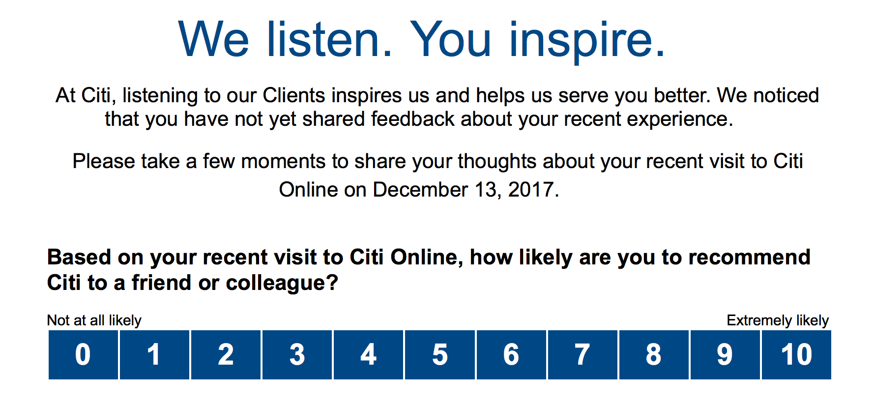
My friend had logged into their Citi account to transfer money. The transaction, 5 days earlier, was unremarkable. Why would someone recommend Citi as a bank due to an unremarkable business transaction. (Routine banking transactions should always be unremarkable. When they stand out, it probably means something went wrong.)
NPS wasn’t designed for this granularity of reflection on the part of the user. They could’ve done 4 other transactions since the one asked about here. Why would they remember the details of any of them, had they gone well?
It’s bad enough we try to use NPS for what it was designed for. When companies try to use it this way, they get themselves into real trouble. The responses will mean nothing.
Embedding NPS into our qualitative research studies
For years now, we’ve embedded the NPS question into our qualitative research studies, asking participants to explain their rationale for the scores they gave. Our top finding is people don’t understand the question.
A typical participant who gives a low score could’ve had a flawless experience with the product or service in our lab. When we ask why they gave the low score, they’ll tell some story about a miserable experience that happened in their past that would prevent them from recommending the service. When we ask them if they’ve used the company’s products or services since, they told us they had done so—many times.
Similarly, we’ll see a participant rate a 10 after they’d really struggled with the product or service. They’ll say, “It was better than I expected” or “I thought it was ok.” When we ask if they would use this product or service again, they say “Probably not.”
We’ve seen many participants rate a 0 because they couldn’t think of anyone to give the recommendation to. Others rated a 10 because they had friends who worked at the company. When the company offers an incentive to respond, say a chance to win a $100 Amazon gift certificate, we’ve seen participants put a high score in because “They’ll never give the prize to someone who gives them a zero.”
We’ve learned that NPS doesn’t tell us anything about the customer’s experience or their loyalty. In fact, we can’t trust NPS to tell us anything useful.
NPS is easy to game
If your bonus is tied to an increase in the NPS ratings, offering a $100 incentive is a great way to raise your scores. That’s not the only way to game NPS.
Improve your results by asking the question later in the user’s flow. An ideal gaming technique is to ask the question after a successful task completion, such as a purchase.
By asking after the task is complete, you only ask the question of those people who succeeded. You eliminate answers from anyone who abandoned the process out of frustration. This naturally skews the results positively.
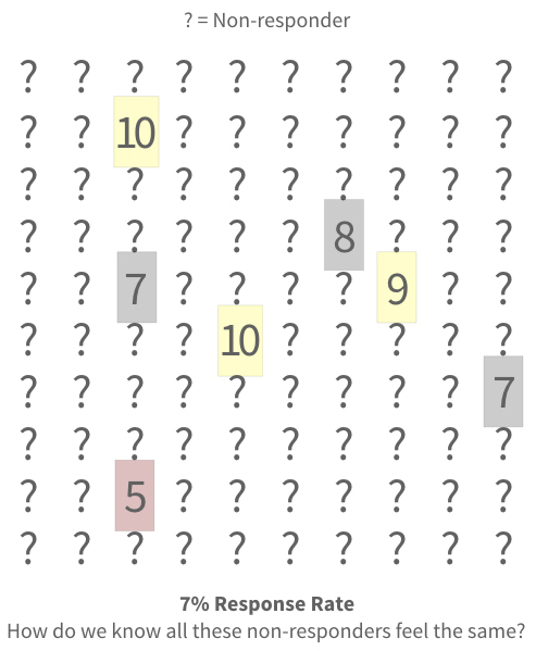
Another trick is to ignore response rates. Most NPS follow up or post-task surveys only get a 4%-7% response rate. A 7% response rate means, for every response you get, 13 people aren’t responding. Would those 13 people give the same score as the person who responded? Probably not.
One reason for low response rates is people you’ve frustrated probably won’t bother giving you feedback. Using Fred Reichheld’s loyalty definition, these folks aren’t interested in investing further.
To really game the score, encourage detractors to drop out early. By intentionally forcing abandonment by making a miserable experience, you skew all the respondents to be positive experiences. (Even if you don’t do this intentionally, it’s easy to do by accident, with almost no methods to discover and correct the problems.)
These dark NPS techniques produce higher scores, which lead to bigger bonuses. Everybody wins, right?
We consider NPS to be harmful. It’s easy to game NPS to look like you’ve made experience improvements when you may have made it worse.
The real value is in the follow up question
NPS believers tell us no implementation ever asks only for the number. Every smart implementation follows up with a qualitative question, asking why? Some sophisticated systems will vary the question based on the score, asking promoters “What did we do well?” and detractors “What could we improve?”.
They’re right. The real value is the Why answer. The customer tells you what just happened, and you could improve it (or make sure you don’t break the things that work well).
To these NPS proponents, I tell them that it’s great they are getting this valuable data. Why should they bother with the score question at all? Just ask the qualitative question. Their response is usually some mumbling and huff-puffery about segmentation or indicators or some other mumbo-jumbo that makes no sense.
We add these Why questions to in-person qualitative user studies. The responses often hint at the problems and working parts of the design. Meanwhile, the same respondents’ NPS scores rarely match anything that happened during their session. This reflects the data we collect in the real world. NPS isn’t based on any reality we live in.
But our executives want a number!
Recently, a Fortune 500 company’s Senior Vice President of Design told me “Every department gets up at the senior staff meeting and gives a number, often NPS. If I can’t use NPS, I need another number. I need a number that tells everyone how we’ve improved.”
There are tons of numbers. An infinite number of them, in fact.
Yet, there’s no one number that represents a company’s customer experience. Not even NPS. Yet, that won’t stop us from trying.
We could use a business number, like the number of subscriptions or the amount of churn. We could use sales, net revenues, or profits.
These numbers don’t speak directly to the design of the products or services. They don’t tell us whether the customers are satisfied, or better yet, delighted.
That’s what NPS is trying to do, even though it doesn’t come close to succeeding. What could we do instead? Here’s some alternatives:

How delighted or frustrated were you today?
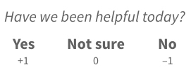
Have we been helpful today?
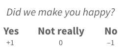
Did we make you happy?
I don’t think it matters, assuming what you’re truly interested in is the next question or some variation:
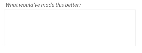
What would’ve made it better?
The follow up question is where the value is. You can ask it a multitude of ways. What’s important is you need to listen to your customer.
We can’t reduce user experience to a single number
This is the biggest flaw of NPS. It tries to achieve an outcome that can’t be achieved. It’s appealing to our management because it promises to solve a problem that can’t be solved so simply.
Customer experience is the sum total of all the interactions our customers have with our products, sites, employees, and the brand. Every sequence of interactions will differ for every customer.
People who believe in NPS believe in something that doesn’t actually do what they want. NPS scores are the equivalent of a daily horoscope. There’s no science here, just faith.
As UX professionals, we probably can’t convince believers that their astrology isn’t real. However, we can avoid the traps and use measures that will deliver more value to the organization.
How likely are you to recommend this article to your friends or colleagues?
UX Leadership and Influence program
(Formerly called the How to Win Stakeholders & Influence Decisions program.)

Our 16-Week program guides you step-by-step in selling your toughest stakeholders on the value
of UX
research and design.
Win over the hardest of the hard-to-convince stakeholders in your organization. Get teams to
adopt a
user-centered approach. Gain traction by doing your best UX work.
Join us to influence meaningful improvements in your organization’s products and services.
Learn more about our UX Leadership and Influence program today!

