Deciding When Graphics Will Help (and When They Won’t)
At the online Samsonite Outlet Store, shoppers can choose from a variety of suitcase models. They can choose between Boarding Bags, Carry-On Bags, Carry-on Luggage, Rolling Luggage, and something called Spinner Luggage, to name a few.
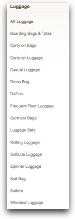
The problem is, it’s not clear what the differences are between these choices. If you want something small that you can take on a plane with a handle and wheels, which would you pick? When we watched people shopping on the site, they didn’t know.
Pictures would’ve made a huge difference. Images or illustrations of each type would help users figure it out, without having to learn luggage industry jargon.
When Graphics Help
Graphics, like the would-be suitcase images, help when they improve the users’ experience. However, we’ve found not all graphics improve the experience. Some images just take up space or, in the worst case, confuse the user.
Graphics, including images, icons, and illustrations, aren’t free. They have to be conceived, rendered, managed, and curated. This eats limited resources that could provide better value on other aspects of the design, such as the navigation or copy.
To decide when a graphic is worth the investment, we’ve classified them into three types: Navigation Graphics, Content Graphics, and Ornamental Graphics. Our research consistently shows that well-done navigation and content graphics contribute to the users’ experience. It’s much harder to see the value from Ornamental Graphics. It seems, in most cases, they are a distraction for both the designer and the user.
Navigation Graphics
If the Samsonite Outlet Store site had those would-be suitcase images, we’d call them Navigation Graphics. They’d give off scent to the user, guiding them to the information they’re seeking.
When navigation graphics aren’t present, the user must rely on the words on the page. A visually descriptive image can do wonders in figuring out the next move.
(Interesting fact: navigation graphics aren’t always links. When they help the user decide where to click, they do their job.)
Electronics retailer, BestBuy.com, is in a similar situation to the Samsonite Outlet Store. Product lines, such as Digital Cameras, for example, have their own descriptive language, with jargon like Point & Shoot or DSLR.

To help shoppers navigate through their selection, they’ve put together a simple image, showing both the type of camera and its name. This trains the users on the vocabulary while providing clear guidance on where to click next.
Well-done navigation graphics helps users. These graphics add to the conversation, providing a visual insight that couldn’t come from only words. When designers use the right images, they improve the users’ experience.
Content Graphics
While the mission of Navigation Graphics is to guide the user to their target information, Content Graphics deliver the information they are seeking.
People looking on Craigslist for a new apartment need to know which ads to pursue. Landlords can upload pictures that show the property’s exterior and interior views.

These pictures are Content Graphics, helping potential renters glean information they couldn’t find out from a written description.
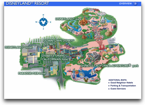
The best content graphics helps the viewer answer specific questions. Folks visiting Disneyland, for example, may want to plan an optimal path through the theme parks, so they hit their favorite rides during a short stay.
Ornamental Graphics
In the loan section of the site of banking giant Citi, there’s a prominent image of people shaking hands.

Yet, in the loan section of Eastern Bank’s site, the only graphic besides the bank’s logo is a tiny little image associated with the mortgage calculator.

Will we trust Citi more because of smiling people shaking on a deal?
The handshake on the Citi loan page is what we call an Ornamental Graphic. It doesn’t guide users to other content on the site, so it isn’t a Navigation Graphic. There isn’t any useful information in the image, so we wouldn’t call it a Content Graphic.
We think the handshake image’s purpose is to communicate some important, non-tangible attribute, such as how Citi is giving out mortgages again. Designers tell us they include these graphics when they want the site to feel more professional, friendly, or fun. However, does including an ornamental graphic have the effect the designers intend?/
T-Mobile’s site is filled with many pictures of spokes-celebrity, Catherine Zeta Jones. However, as we watched phone shoppers work through the site, they showed increasing frustration each time her picture appeared, instead of images that might be more informative.

One older shopper, interested in buying a phone with easy-to-press large buttons, became frustrated when she couldn’t discern the button size in any of the pictures. When she spotted Catherine Zeta Jones holding a phone she liked, she became exasperated. “She’s a very pretty woman,” the shopper told us, “I just wish I could see her buttons.”
Designers tell us they use ornamental graphics to break up the page, reducing the density of the text. This is a noble goal, as we know large blocks of text can be difficult to work from. However, random images don’t help with the problem.
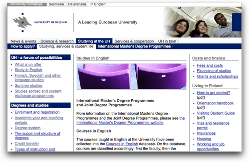
The template of the University of Helsinki’s site has a space at the top for a graphic. Unfortunately, it seems the designers didn’t have useful graphics, so they filled it with random images. For example, several pages are adorned with a pair of purple chairs, which neither communicate anything about the university or the page’s content.
What do ornamental graphics bring to the users experience? We’re not sure. We can’t find any evidence they help users trust a site better or make it seem more professional or friendly. While they can reduce the density of large text blocks, there are more effective layout techniques to get the same result.
The Value of Graphics
Over the years, we’ve seen plenty of ineffectual attempts at navigation graphics and content graphics—images that didn’t do what the designer intended. However, we’ve seen enough well done graphics of both types that it’s clear they can improve the users’ experience.
Navigation Graphics assist the user in finding the information they need, often in a way text can’t do by itself. Content Graphics communicate important information, helping users achieve their goal. As for Ornamental Graphics, at best, they neither help nor hurt.
Yet graphics don’t come without cost. We recommend teams, looking to deliver high value, focus on delivering navigation and content graphics. Resist the temptation for ornamental graphics.
UX Leadership and Influence program
(Formerly called the How to Win Stakeholders & Influence Decisions program.)

Our 16-Week program guides you step-by-step in selling your toughest stakeholders on the value
of UX
research and design.
Win over the hardest of the hard-to-convince stakeholders in your organization. Get teams to
adopt a
user-centered approach. Gain traction by doing your best UX work.
Join us to influence meaningful improvements in your organization’s products and services.
Learn more about our UX Leadership and Influence program today!

