How I Draft an Information Architecture
Originally published on Donna's blog on July 29, 2009.
When I teach information architecture, the most common questions aren’t about the principles, but about the process. Just how do you decide on a particular method, how do you choose categories, how do you know what you’ve come up with is right?
As a teacher I’ve spent much time thinking about this, reflecting on my own process and how it actually works for me. And I’ve figured out the answer.
When I teach, I tell people this answer. Most are surprised, but there are always a couple of people in the room who nod to themselves and look comforted.
Would you like to know the answer?
Here it is.
Wait for the surprise.
Just make it up.
Yep. As some high profile product says, just do it.
This is surprisingly easy, but there is a dependency. You need information. You need to understand what you are trying to achieve, what users of the service need and know, and you need to know the content well. If you don’t have these things, it will be hard. But if you do have them, pulling them together into a first draft is surprisingly easy.
When you have made something up—and I don’t care whether you do it on a whiteboard, in a spreadsheet, or in your head—then start thinking about whether it will work for the users, and whether it will work for the content. Revise and play with your idea until these things start to fall together.
At some point you’ll start to feel good about your made up draft IA. In your head, it will look like it will work for the users and the content will fit in. You can see how it will help the organization achieve its goals. (If you can’t get to this point, it’s likely you are missing some kind of information. You’ll need to do something to fix that, or it will never work).
For me, there’s a funny feeling at this point—it feels simple and clear and makes me wonder why it took me so long to figure out. That’s when I stop fiddling and start talking to people about it. And I’m yet to be majorly wrong, so there must be something in it.
Today’s Example
So I was doing this today for a client (I won’t say who, not that it’s sensitive—I just haven’t mentioned this to them). I took photos as I played with the new IA & thought you might be interested.
The background is that this is a fairly straightforward redesign of some government content. I know what the team wants out of it, have done some basic user research, cleaned up the content, and decided what to keep and create. It will be for a simple hierarchical site, so the IA in this case is a set of categories/subcategories to be used in navigation.
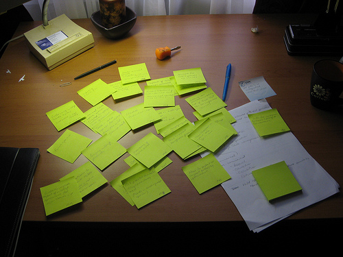
I don’t always do it like this, but today I jotted the main content chunks onto sticky notes. Apart from being physical, this helps me get away from the way content is organized now.

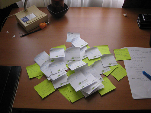
Then I jotted things we learned from user research onto a different color note.

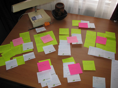
Then I shuffled them around into groups of things that go well together.

I played with these for a little while and moved a couple of things between piles, but it wasn’t hard. It fell together easily. All the user needs are catered and all the content fits in. There are some spots where we need some extra content, and there is no content that someone doesn’t need. I could come up with sensible titles for all the groups.
My follow up step from this was to create a quick spreadsheet with the categories, subcategories and main content pages that came out of this shuffle; and also add a couple of special navigation items that will pull together some things across the piles (like forms and publications, which are scattered across the piles according to their topic, but will need separate entry points for some user tasks).
Next Steps
Tomorrow I’m going to run through this with the client team. I’m not drawing it up into a sitemap now. I’m going to talk them through it as I draw it on a whiteboard. This lets me describe each section and the rationale behind it, without them being distracted by something I have already written down. I’ve done this before and it is a great trick for communicating the draft IA—it lets me present it as a story, and triggers sensible questions.
Then, of course, there is lots more to do. I’ll be using an existing navigation approach, so don’t need to design navigation. But I need to design all of the index pages—these will introduce each topic and provide deeper links plus cross links.
And we need to revise all the content. As this happens, the IA will change, but if I’ve done my job well it won’t change dramatically.
What, No Card Sort?
OMG, I just wrote a book on card sorting, and didn’t run a card sort. Why not?
Well, I did other forms of user research which gave me a fairly good idea of the main issues and needs for users. Most users only ever need one or two content pieces, so there was little point getting them to do a card sort on things they don’t care about. And I didn’t feel like I had big gaps in my knowledge that would mean a card sort would help. So I didn’t.
We’ll do usability testing on this as well, probably before content rewriting and after.
UX Leadership and Influence program
(Formerly called the How to Win Stakeholders & Influence Decisions program.)

Our 16-Week program guides you step-by-step in selling your toughest stakeholders on the value
of UX
research and design.
Win over the hardest of the hard-to-convince stakeholders in your organization. Get teams to
adopt a
user-centered approach. Gain traction by doing your best UX work.
Join us to influence meaningful improvements in your organization’s products and services.
Learn more about our UX Leadership and Influence program today!

