The Magic Behind Amazon’s 2.7 Billion Dollar Question
Thanks to Marco Dini for the Italian translation to this article.
Since its release in 2007, the last volume of the Harry Potter series, Harry Potter and the Deathly Hallows, has garnered 3,490 reviews from Amazon.com customers. While response has been overwhelmingly positive for the book, several hundred Amazon customers rated the book as mediocre or worse.
Because of a very subtle yet clever feature, Amazon makes the best of both the positive and negative reviews easy to find. And that feature, based on our calculations, is responsible for more than $2,700,000,000 of new revenue for Amazon every year. Not bad for what is essentially a simple question: ”Was this review helpful to you?“

Amazon had reviews from the very first day. It’s always been a feature that customers love. (Many non-customers talk about how they check out the reviews on Amazon first, then buy the product someplace else.)
Initially, the review system was purely chronological. The designers didn’t account for users entering hundreds or thousands of reviews.
Interestingly, only a fringe portion of the audience writes reviews. For example, while Harry Potter and the Deathly Hallows has more than 3,000 reviews, our calculations indicate Amazon sold more than 4,000,000 copies of the book. That’s 0.075% or only one out of every 1,300 purchasers that took the time to write a review.
For small numbers, chronology works just fine. However, it quickly becomes unmanageable. (For example, anyone who discovers an established blog may feel they’ve come in at the middle of a conversation, since only the most recent topics are presented first. It seems as if the writer assumed the readers had read everything from the beginning.)
The problem came with the eleventh review. Since the product page only showed ten on the first page, the eleventh pushed the earliest review onto a different page. This worked fine as long as every new review was better than the existing ones.
But that wasn’t happening. Newer reviews often had a what-he-said vibe to them, echoing the sentiments of the well-written reviews, while, at the same time pushing them out of the reader’s view.
Adding Editorial Perspective
Amazon needed a way to make the best reviews bubble to the top. The obvious approach would be an editorial team to select the best reviews for highlighting.
However, the cost would be exorbitant. While Amazon already has a team that checks reviews to eliminate spam and off-topic comments (you never see unwanted promotions in their reviews), it’s a lot more work to rate each review and select the best.
Doing so would also go against Amazon’s philosophy of letting the market decide what’s good and bad, which makes Amazon a trusted agent. If customers perceived Amazon was selecting reviews for items that provided better profits or manufacturer kick-backs, it could damage the credibility the site.
So the team had to come up with an approach that scaled well but didn’t hurt credibility. In true Amazon tradition, why not ask the customers what they thought?
The Elegance of the Question
Even though the question is one of Amazon’s most important features, it’s impressive how understated its introduction was. One day, for many of Amazon’s users (but not all), it just showed up. It was one of many changes occurring on the site that month. Most users didn’t notice it for weeks and few understood how it was going to change the value of the reviews. (It’s not even clear that the team, when they launched it, truly understood what was about to happen.)
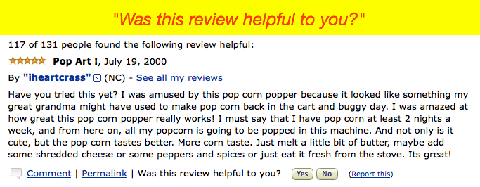
Even today, little effort is made to draw attention to the question. It falls neatly at the bottom of each review with two simple buttons: Yes and No.
Even though this is a critical function, it’s easy for most visitors to miss. It blends nicely into the review above it.
Similarly, reviews only acquire the “n of n people have found the following helpful” heading when someone has voted. Amazon doesn’t taint a review just because nobody has voted yet.
Even the behavior of clicking Yes or No is elegant. Amazon tracks who rates each review as helpful, allowing each person to only vote once. This prevents “gaming the system” by voting for a friend’s (or your own) review multiple times. Clicking either Yes or No pops up a quick message, saying the vote will take effect within 24 hours. (This delay also reduces gaming.)
Amazon quietly bumps the three most helpful reviews to the top. It tries to balance positive and negative reviews, so shoppers get a balanced perspective. An interesting side effect is how these selected reviews get more votes. If they are controversial (in that not everyone agrees they were helpful), their ratio goes down, allowing the most helpful reviews to bubble up past them.
This makes it a self-managing system, letting the reviews people find the most helpful to maintain their standing at the top of the list. The result is an understated implementation that works great.
Amazon’s Subsequent Enhancements
Since the initial release of the helpfulness question, Amazon’s team has played with many variations, some of which have become mainstays of the design. One of the first enhancements was to use Ajax instead of a page refresh when the user pressed the Yes or No button.
This simple change of removing the page refresh dramatically increased the likelihood a user would vote on more reviews.
To make more room on the product page, Amazon reduced the number of reviews they initially display. Now, when they have helpful reviews, they appear separate from the rest. On the most popular products, only the most helpful reviews show up.
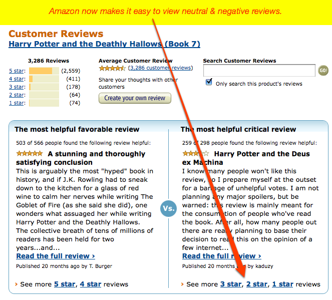
Recently, Amazon has added a tally feature to the ratings, summing the five-, four-, three-, two-, and one-star reviews. When a reader selects to see all the reviews, the site presents them with a highlight of the most helpful positive review and the most helpful negative review.
In our studies of Amazon shoppers, we found many start by looking at only the negative reviews, using them to try to “talk them out” of buying the product. Interestingly, Amazon now has a feature to easily see the more negative reviews together.

The Dependence on Volume
While the helpfulness question is extremely powerful for Amazon, we wonder if it can work on other sites as effectively. Amazon has an advantage in that they have millions of visitors every day. The volume of visitors makes this feature work so well.
While only one in 1,300 purchasers of the product writes a review, the number who indicate a review was helpful is even fewer. For the Harry Potter volume, which is Amazon’s best selling product ever, it was about 0.0014% or about one in 7,300 purchasers of the product. The most helpful review garnered only 566 votes, even though it was written on the first day the book was released and Amazon has sold more than 2,000,000 copies since.
Using the pattern we see frequently in web use, we can predict that the number of reviews that will get any votes follows a power-law distribution. This means that only a few will get a substantial number of votes (helped by the fact they’ll be promoted to the top). A handful will get a small number of helpfulness votes, but most reviews won’t get any.
Because of the power-law distribution, on sites with substantially lower traffic than Amazon, it’s very possible that the helpfulness question won’t be answered enough to be useful. That said, if it’s implemented like Amazon and reviews without votes avoid saying ”0 of 0 people found this helpful“, there’s probably no harm in implementing it for lower volume sites.
The Power of Good Design
In 2008, Amazon brought in $19 billion, of which 70% came from media products, such as books, movies, and music. It’s not an accident that these products also make the best use of the reviews feature.
As we’ve watched Amazon customers make purchases on the site, we can clearly see that promoting the most helpful reviews has increased sales in these categories by 20%.(One out of every five customers decides to complete the purchase because of the strength of the reviews.) From this, we can project it has contributed to Amazon’s top line by $2.7 billion.
This is a case of a simple question—asked in the right way at the right time—that can have a dramatic affect on the success of the organization. Simple, subtle design once again proves it has great magical powers (and, in the right circumstances, very lucrative ones).
UX Leadership and Influence program
(Formerly called the How to Win Stakeholders & Influence Decisions program.)

Our 16-Week program guides you step-by-step in selling your toughest stakeholders on the value
of UX
research and design.
Win over the hardest of the hard-to-convince stakeholders in your organization. Get teams to
adopt a
user-centered approach. Gain traction by doing your best UX work.
Join us to influence meaningful improvements in your organization’s products and services.
Learn more about our UX Leadership and Influence program today!

