Prioritizing Design Time: A Long Tail Approach
Do you find that you spend an inordinate amount of time fretting over your homepage? Is it the one page that gets the most attention from your design team? How about other parts of your company? Does it get attention even from people who aren’t on the design team?
We see this all the time. On nearly every one of the projects that we work on, and even the ones that we only hear about, we observe the same thing: the homepage has the highest priority in the design food chain. Much more energy is spent deciding what will go where on the home page than any other page or section of the web site.
The reason is simple. It’s the page with the most page views. Here is a snippet of uie.com’s page views over a few days recently.
| Page | Views |
|---|---|
| UIE.com Homepage | 4215 |
| What User’s Want (.pdf) | 1267 |
| Brain Sparks Blog | 941 |
| 5-Second Tests: Measuring Your Site’s Content Pages | 930 |
| UIE Roadshow 2006: Web Design Foundations | 717 |
| UIE Articles Index | 712 |
| User Interface Conference | 552 |
| UIE Publications Index | 446 |
The first reaction to a ranked list like this is to pay attention to whatever is ranked at the top. And inevitably, on the Web, that will be the homepage. After all, it’s the default page when someone visits the site. It ends up being an easy target for designers (and everyone else) to focus on.
However, if we push further with these numbers, stretch them out a bit, we actually paint a very different picture of where focus could be paid.
First off is the amazing statistic that the homepage accounts for only 1/10th of the total pageviews. In other words, approximately 90% of the time people spend on our web site is not on the home page! That suggests that there is a sizeable set of pages other than the homepage that fulfill the needs of our users.
And that brings us to The Long Tail. The Long Tail is an economic theory made popular by Chris Anderson, chief editor of Wired Magazine, who pointed out that the Web is enabling a whole class of content to be shared which wasn’t sharable before. Anderson uses physical items like CDs and books as his primary examples, noting that Amazon sells many more unpopular CDs than it does the most popular ones. (simply because there are so much more of them) Interestingly, the theory is equally applicable to those dark and dusty pages on your web site that don’t get much attention relative to the few popular ones.

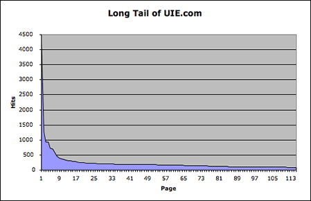
In this graph, the homepage sits on the left, getting over 4000 views for the time period. But look to the right, the mass of area filled in with blue. That represents the rest of the pages (I included all the pages that got over 90 views in the time period—the entire tail is much longer). These are the pages that get the vast majority of attention.
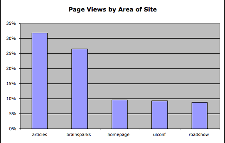
The Long Tail popularizes what mathematicians realized early on when they started researching the Web. That is, there is a pattern to the way that we browse web sites. The pattern is that there will always be a most popular page (usually the homepage) and there will always be a huge collection of pages that garner less individual attention but add up to the vast majority when put together. Going further, when we separate out the pages in the tail into what areas of the site they are in, we can get an even clearer idea of where people are spending their time.

As you can see, the section of UIE.com that gets the most traffic is our articles section. This is followed by our Brain Sparks blog posts. Even though these sections of the site are made up of multiple pages, they’re mostly template-driven. Therefore, it might make sense to really optimize these templates before moving on to less-visited sections of the site.
We think it’s worth investigating the relationship of where users and designers spend their time. It might make sense for designers to spend most of their time where users spend most of their time. That way, designers will affect the most users possible with any improvements they make.
If you’re a long-time reader of ours, you won’t be surprised by this suggestion. We’ve long sensed that too much effort was spent on homepages. Our research continually shows it. (as do our site stats!) Not coincidentally, we often talk about this very topic at our Conference and Roadshow events.
Nothing beats a good buzzword, and we’ve found that The Long Tail is an effective way to communicate some of the issues design teams face. (In addition, it makes a great visual and opens up a slew of opportunities for making puns) So that’s a little of what we’ve learned from analyzing our own tail. What does your Long Tail tell you?
UX Leadership and Influence program
(Formerly called the How to Win Stakeholders & Influence Decisions program.)

Our 16-Week program guides you step-by-step in selling your toughest stakeholders on the value
of UX
research and design.
Win over the hardest of the hard-to-convince stakeholders in your organization. Get teams to
adopt a
user-centered approach. Gain traction by doing your best UX work.
Join us to influence meaningful improvements in your organization’s products and services.
Learn more about our UX Leadership and Influence program today!

